How to create Organizational Chart Diagram as custom widget in Bold BI
An organizational chart custom widget helps to visualize the relationship hierarchy and its structure. Its layout starts parsing from the root and iterates through all its child elements. The Bold BI Dashboard custom widget allows the user(s) to add any user-defined widget, d3 controls, Syncfusion controls, or any JS widgets in a dashboard, and it can perform like the normal widget.
Creating Organizational Chart as a Custom Widget
Follow the below steps to create an Organizational chart custom widget:- Download the Organizational chart custom widget from the link.
- Bold BI Custom Widget Utility (bicw.exe) is used to create and manage the custom widget, and it will be shipped along with the Bold BI Application setup installation in the following folder.
Create command is used to create the widget in the specified path with provided name along with its unique GUID.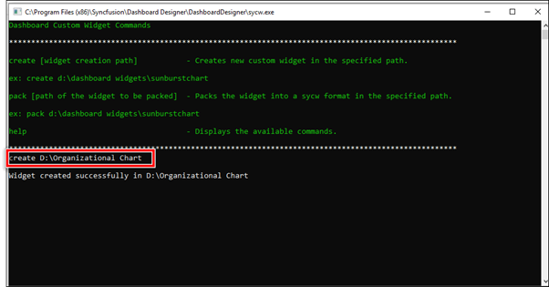
- Download the Diagram control from https://csg.syncfusion.com/.
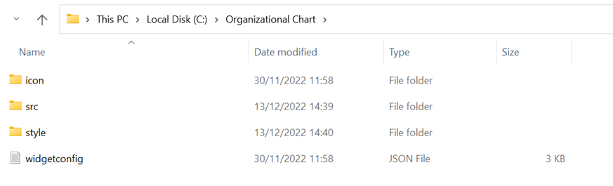
After downloading find the following files after extracting the downloaded folder.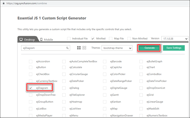
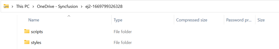
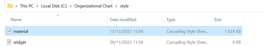
- Copy and paste the downloaded scripts and styles files of Diagram control into the custom widget created location as shown in the following image.
Script:
Styles: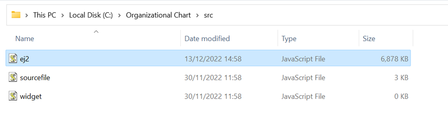
- Open the Manifest configuration file of the custom widget in the following location.
Refer to the copied script and style files in the above highlighted file. Also add the dependency scripts and refer it as in the below image.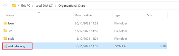
"dependencies": {
   "scripts": [
     "src/ej.widget.all.min.js"
   ],
   "styles": [
     "style/widget.css"
   ]
 },
NOTE: Users can edit(Renaming the widget name, display name, description, data field configuration) the custom widget as per their requirement. Click on this link for further details.
- Create a div element to initialize the custom widget as shown in the following code samples in the above-mentioned source file, which is “Sourcefile.js.” Assign id for the created div. Once the widget div was created, append this div to its parent div.
init: function () { /* init method will be called when the widget is initialized */ var widget = document.createElement("div"); widget.setAttribute("id", "diagram"); this.element.appendChild(widget); if(this.model.dataSource.length > 0){ window.label = this.model.boundColumns.Label[0].uniqueColumnName; window.id = this.model.boundColumns.Id[0].uniqueColumnName; window.parent = this.model.boundColumns.Parent[0].uniqueColumnName; var data = this.model.dataSource; //data.forEach((d, v)=> { for(x in d) { if(d[x] == "(Null)") { delete d[x] }; }}); $.map(data, function (value, index) { if(value[window.parent] == "(Blanks)") { delete value[window.parent] } }); } - Use Syncfusion Essential EJ2 Diagram control to create this custom widget. Refer to the highlighted diagram control script and its dependency script files in the following location.
We have used the API’s of diagram control to define the custom widget chart layout.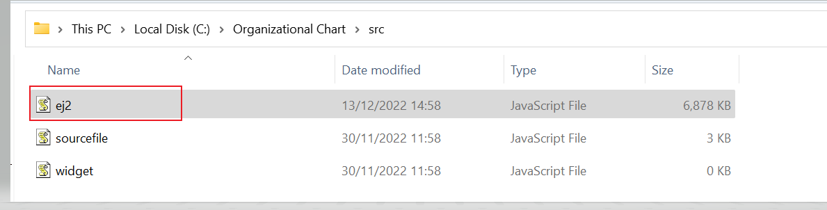
     $("#diagram").ejDiagram(
           {
               height: this.element.style.height,width: this.element.style.width, tool: ej.datavisualization.Diagram.Tool.SingleSelect        | ej.datavisualization.Diagram.Tool.ZoomPan,
               layout: { type: "organizationalchart", marginX:3,marginY:3, getLayoutInfo: $.proxy(this.getLayoutInfo) },
               defaultSettings: {
                   node: { constraints: ej.datavisualization.Diagram.NodeConstraints.Select, addInfo:$.proxy(addInfo), width: 100, height: 40, borderColor: "black", labels: [{ fontColor: "#ffffff" }] },
                   connector: {
                       lineColor: "#000000", segments: [{ type: "orthogonal" }], targetDecorator: { shape: "none" },
                       constraints: ej.datavisualization.Diagram.ConnectorConstraints.None
                   }
               },
               enableContextMenu : false,
               selectedItems: { constraints: ~ej.datavisualization.Diagram.SelectorConstraints.Rotator },
               nodeTemplate: $.proxy(this.nodeTemplate),
               dataSourceSettings: {
                   id: window.id, parent: window.parent, dataSource: data
               },
               pageSettings: {
                   scrollLimit: "diagram", muliplePages: false
               },
               snapSettings: {
                   snapConstraints: ej.datavisualization.Diagram.SnapConstraints.None
               },
           });
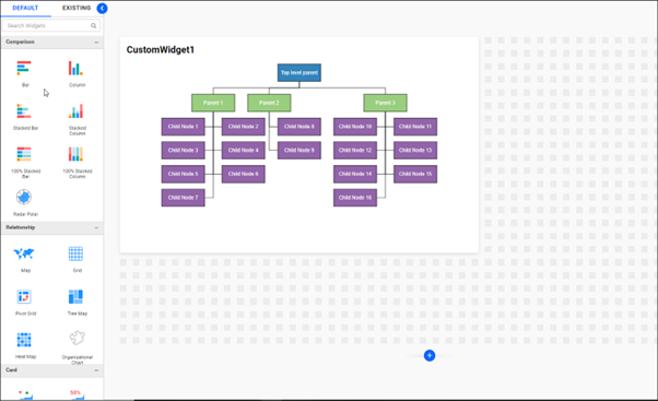
- Define the data source in the following format.
var data = [
                 { "Id": "Parent", "Function": "Top level parent" },
                 { "Id": "1", "Function": "Parent 1", "Phase": "Parent" },
                 { "Id": "2", "Function": "Parent 2", "Phase": "Parent" },
                 { "Id": "3", "Function": "Parent 3", "Phase": "Parent" },
                 { "Id": "4", "Function": "Child Node 1", "Phase": "1" },
                 { "Id": "5", "Function": "Child Node 2", "Phase": "1" },
                 { "Id": "6", "Function": "Child Node 3", "Phase": "1" },
                 { "Id": "7", "Function": "Child Node 4", "Phase": "1" },
                 { "Id": "8", "Function": "Child Node 5", "Phase": "1" },
                 { "Id": "9", "Function": "Child Node 6", "Phase": "1" },
                 { "Id": "10", "Function": "Child Node 7", "Phase": "1" },
                 { "Id": "11", "Function": "Child Node 8", "Phase": "2" },
                 { "Id": "12", "Function": "Child Node 9", "Phase": "2" },
                 { "Id": "13", "Function": "Child Node 10", "Phase": "3" },
                 { "Id": "14", "Function": "Child Node 11", "Phase": "3" },
                 { "Id": "15", "Function": "Child Node 12", "Phase": "3" },
                 { "Id": "16", "Function": "Child Node 13", "Phase": "3" },
                 { "Id": "17", "Function": "Child Node 14", "Phase": "3" },
                 { "Id": "18", "Function": "Child Node 15", "Phase": "3" },
                 { "Id": "19", "Function": "Child Node 16", "Phase": "3" }
           ];
Id – Defines the id of each node.
Function – Act as label for each node.
Phase – Defines the id of the parent node.
- Node is a graphical object used to visually represent the geometrical information or process flow. You must define the node object as in the following code samples and add that node collection to the Diagram property on the initialization.
nodeTemplate: $.proxy(this.nodeTemplate), dataSourceSettings: { id: window.id, parent: window.parent, dataSource: data }, pageSettings: { scrollLimit: "diagram", muliplePages: false }, snapSettings: { snapConstraints: ej.datavisualization.Diagram.SnapConstraints.None }, }); }, update: function (option) { this.element.innerHTML = ""; this.init(); return; }, nodeTemplate: function (diagram, node) { node.labels[0].text = node[window.label]; node.fillColor = node.Color; if (node[window.id]== "Parent") { node.fillColor = "#3484bb"; } if (node[window.parent] == "Parent") { node.fillColor = "#9ace7f"; } if (node[window.parent] == "1") { node.fillColor = "#9264aa"; } if (node[window.parent] == "2") { node.fillColor = "#9264aa"; } if (node[window.parent] == "3") { node.fillColor = "#9264aa"; } }, - Pack the custom widget as in the link. Execute the following syntax in the “bicw.exe” in Bold BI Application.
Syntax: pack [path of the widget to be packed]
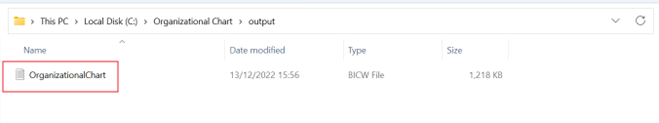
Now you get the “. bicw” file of the Organizational Chart custom widget inside the output folder as mentioned in the above image.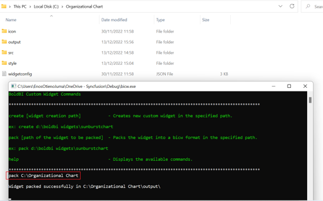
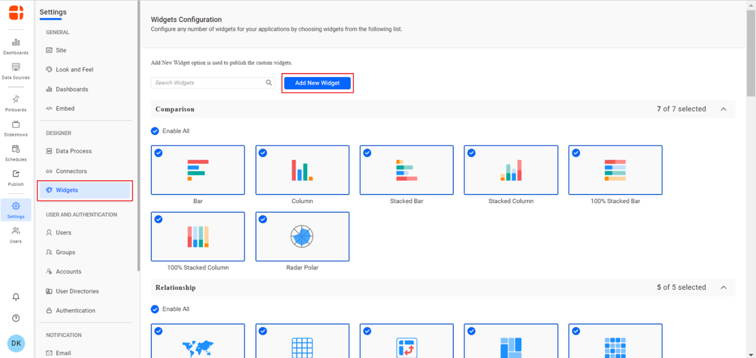
Importing custom widget “. bicw” file into Bold BI
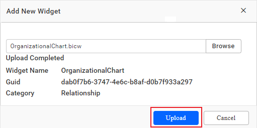
Follow the steps below to import the custom widget “. bicw” file into the Bold BI Application.- From the Widgets menu in the settings page of Bold BI application, select ‘Add New Widget’ to import.
- Choose ‘Add widget’from the Manage Custom widgets pop-up and add the custom widget file which has the extension “. bicw”.
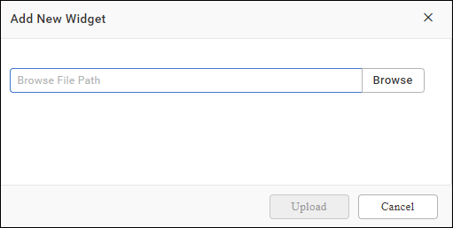
- The file will be added as in the following image then click Upload.
- Close the pop-up, the custom widget file will be added in the widgets Relationship section as in the following screenshot.
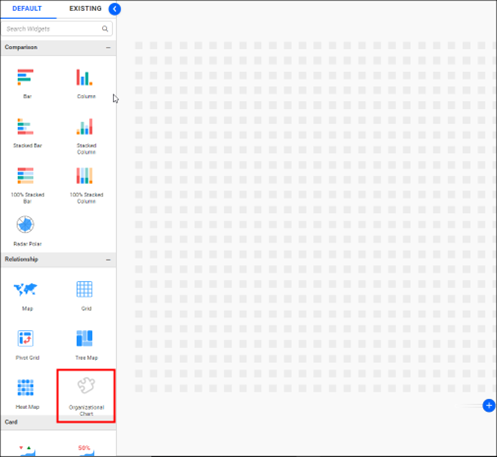
- Drag and drop the custom widget from the widgets section and bind the data to the custom widget and preview it.
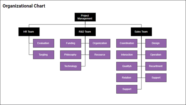
- Provide the data source as in the following format to create organizational chart.
JSON DATA:
var data = [
          {  “Id” :  “Parent”,   “Function”:   “Project Management”   },
          {  “Id” :  “1”,   “Function”:   “R&D Team”,”Phase”: “ parent”   },
          {  “Id” :  “2”,   “Function”:   “HR Team”,”Phase”: “ parent”   },
          {  “Id” :  “3”,   “Function”:   “Sales Team”,”Phase”:  “parent”   },
          {  “Id” :  “4”,   “Function”:   “Philosophy”,”Phase”:  “1”   },
          {  “Id” :  “5”,   “Function”:   “Organization”,”Phase”:  “1”   },
          {  “Id” :  “6”,   “Function”:   “Technology”,”Phase”:  “1”   },
          {  “Id” :  “7”,   “Function”:   “Funding”,”Phase”:  “1”   },
          {  “Id” :  “8”,   “Function”:   “Resource”,”Phase”:  “1”   },
          {  “Id” :  “9”,   “Function”:   “Targeting”,”Phase”:  “1”   },
          {  “Id” :  “10”,   “Function”:   “Evaluation”,”Phase”:  “1”   },
          {  “Id” :  “11”,   “Function”:   “Recruitment”,”Phase”:  “2”   },
          {  “Id” :  “12”,   “Function”:   “Relation”,”Phase”:  “2”   },
          {  “Id” :  “13”,   “Function”:   “Design”,”Phase”:  “3”   },
          {  “Id” :  “14”,   “Function”:   “Operation”,”Phase”:  “3”   },
          {  “Id” :  “15”,   “Function”:   “support”,”Phase”:  “3”   },
          {  “Id” :  “16”,   “Function”:   “Quality”,”Phase”:  “3”   },
          {  “Id” :  “17”,   “Function”:   “Interaction”,”Phase”:  “3”   },
          {  “Id” :  “18”,   “Function”:   “Support”,”Phase”:  “3”   },
          {  “Id” :  “19”,   “Function”:   “Coordination”,”Phase”:  “3”   },
];
EXCEL DATA:
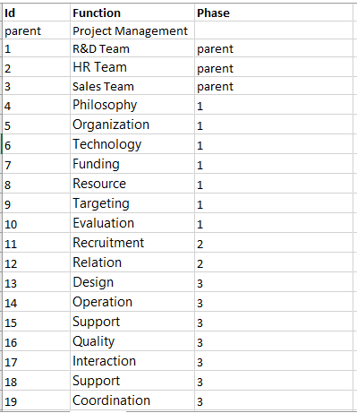
NOTE: Topmost level of the Organization Id should be “parent”. Subsequent level connections can be linked by the corresponding Id, which need to be provided in the “Phase” value.
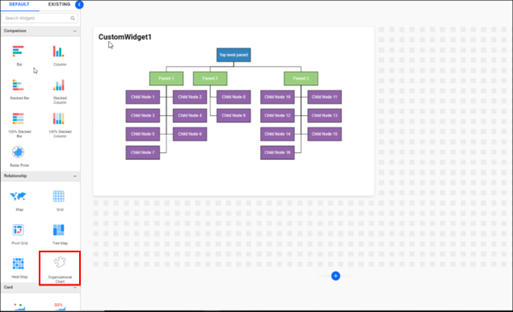
- Map the dimension column with the parent, id, and label field of the custom widget as in the following screenshot.
- Visualize the organization level data as in the following screenshot.
Related links

