How to Create a Bing Maps Widget
Getting Started with the Bing Maps Widget
If you are a Bold BI Cloud user, log in to your cloud site account. If you are an Embedded BI user, open the Bold BI application installed on your server.Click the “New Dashboard” button and select the “Blank Dashboard” option. A pop-up box will prompt you to configure a data source.
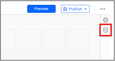
I have an Excel file titled “World Population Data of the year 2020” on my local machine. I can add this file as a new data source by clicking the “Data Sources” icon.
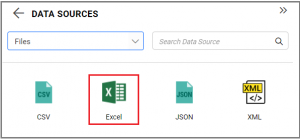
Now, I am going to click “CREATE NEW” to launch a new connection from the connection panel. In the connection panel, I am going to select the “Excel” data source to add my Excel file to Bold BI.
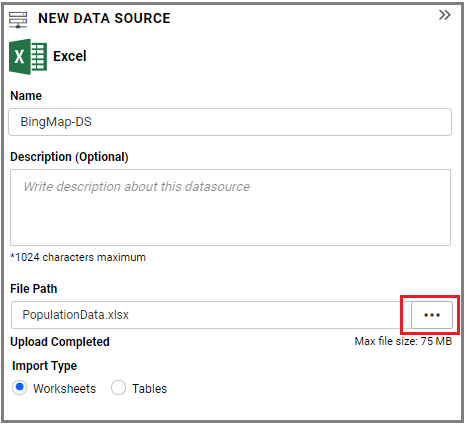
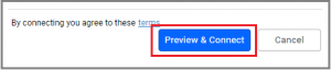
Then, I have to upload my file by using the “Browse” button and clicking “Preview & Connect.” It will navigate to the Data Preview dialog.
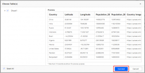
After clicking “Connect,” the data design view page will open as in the image below.
Now, I am going to drop the table in the table canvas and save the data source by clicking the “Save” button.
Selecting the Bing Maps Widget
Once you have added a data source, you can start selecting widgets. For this post, I am going to create a Bing Maps widget.Bing Maps allow you to visualize markers based on latitude and longitude data.
Assigning Data to the Bing Maps Widget
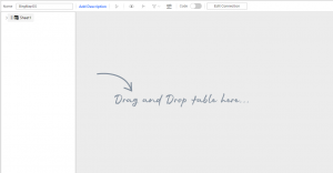
First, I need to drag the Bing Maps widget from the “Relationship” section of the widget menu to my dashboard. Then, I am going to resize the widget by dragging its edges so that it will be easy to read.I would like my widget to display population data for the year 2020 from the available data in my sample Excel file. Now that I have moved the widget to my dashboard, I can assign data to it.
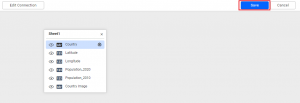
To assign data to my widget, I need to click the “Settings” button in the upper right corner of the widget. Then, I will click the “Assign Data” tab.
I immediately see two columns. In the left column, I can select different fields called “Measures” and “Dimensions.” I can drag these fields to the “Marker Latitude,” “Marker Longitude,” “Column,” “Marker Tooltip,” and “Marker Image” boxes in the right column.
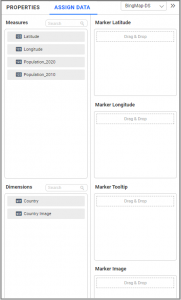
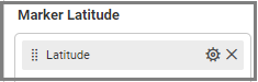
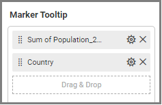
To display population data for the available countries in my sample file, I need to drag the “Latitude” field to the “Marker Latitude” box, the “Longitude” field to the “Marker Longitude” box, and the “Population_2020”and “Country” fields to the “Marker Tooltip” box.
Customizing the Bing Maps Widget
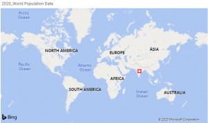
Now that I have assigned data to my widget, I am going to click the “Properties” tab to customize it. First, I am going to change the widget’s name from “BingMap1” to “2020_World Population Data.”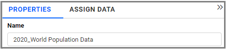
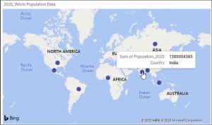
Now, my widget will show countries’ population data, and markers will indicate a country’s location based on latitude and longitude values. Here, I can see the data by hovering over a marker.
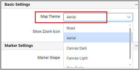
With the help of the “Properties” column, I would like to customize my widget. First, I am going to change the Map Theme to “Aerial” under “Basic Settings.”
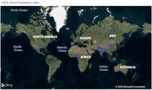
Below, you can see what the widget looks like with the “Aerial” theme.
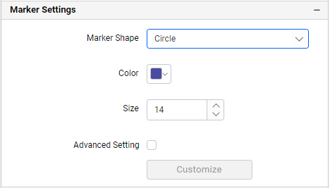
I know I can change the marker shape in “Marker Settings” under the “Properties” column. By default, the marker shape is “Circle.”
Adding Images to the Markers in Bing Maps
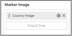
Now, I am going to add custom images to the markers or pushpins in the Bing Maps widget. I can add an image using several different methods that are outlined below.In the “Assign Data” tab under the Marker Image box, I can bind an image field from my data source.
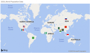
Now, my widget shows population data for countries, along with the countries’ flags.
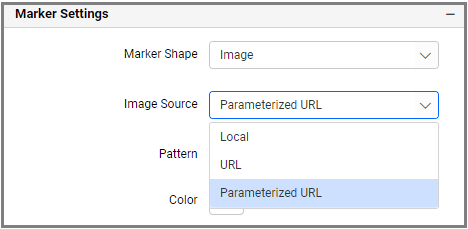
In the “Properties” column, I can browse images from my local system, bind a URL from my data, or build a parameterized URL.
Conditional Formatting in the Bing Maps
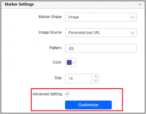
Now, I would like to explore conditional formatting options. With this feature, I can modify the color, size, and shape of the marker based on certain conditions.The conditional formatting option is available in the “Marker Settings” section of the “Properties” column. Enable “Advanced Setting” and add conditions and formatting in the dialog.
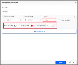
I would like to visualize the country “India” with a different marker shape, color, and size. So, I am going to format the marker as you see below.
With this formatting applied, my widget will look like the image below.