How to Create a Combo Chart Widget?
Getting Started with the Combo Chart Widget
If you are a Bold BI Cloud user, log in to your cloud site account. If you are an Embedded BI user, open the Bold BI application installed on your server.Click the “New Dashboard” button and select the “Blank Dashboard” option. A pop-up box will prompt you to configure a data source.
Bold BI has a great variety of sample data sources to choose from, and for this dashboard, I am selecting our “Image Widget-FIFA world cup 2018 top scores” data source.
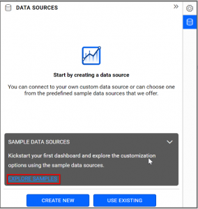
Simply select the data source you would like to use and click “Add”.

Selecting the Combo Chart Widget
Once you have chosen a data source, you can start selecting widgets. For this post, I am going to create a combo chart widget.Combo charts allow you to compare values by combining two charts.
Here, bar charts can be combined with bar, stacked bar, and 100% stacked bar charts. In fact, you can create any combination you like using the following charts: column, line, area, spline, spline area, stacked column, stacked area, 100% stacked column, and 100% stacked area.
Assigning Data to the Combo Chart Widget
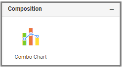
First, I need to drag the combo chart widget from the “Composition” section of the widget menu to my dashboard. Then, I am going to resize the widget by dragging its edges so that it will be easy to read.I know that combo charts allow me to easily compare values by combining two charts in a single widget. By default, primary values render with “Column chart” and secondary values render with “Line chart.”
In this widget, I would like to compare the performance of each player based on their attempts on target and goals scored in the World Cup.
To assign data to my widget, I need to click the “Settings” button in the upper right corner of the widget. Then, I will click the “Assign Data” tab.
I immediately see two columns. In the left column, I can select different fields called “Measures” and “Dimensions.” I can drag these fields to the “Value(s),” “Secondary Value(s),” “Column(s),” and “Tooltip” boxes in the right column.
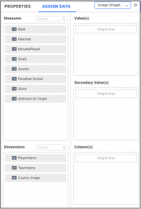
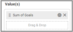
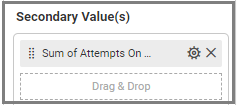
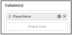
To compare the performance of each player, I need to drag the “Goals” field to the “Value(s)” box, the “Attempts On Target” field to the “Secondary Value(s)” box, and the “PlayerName” field to the “Column” box.
Customizing the Combo Chart Widget
Now that I have assigned data to my widget, I am going to click the “Properties” tab to customize it. First, I am going to change the widget’s name from “ComboChart1” to “Attempts vs Attained Goals.”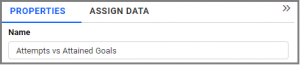
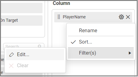
I would like to visualize the top 5 goal scorers along with their numbers of attempts. To achieve this, I can click “Edit” under the “Filter(s)” option in the Column “Settings” menu.
When I click the “Edit” option, a dialog will open. There, I am going to enable “Rank” and set the Count to ‘5’ for the “Goals” Column.
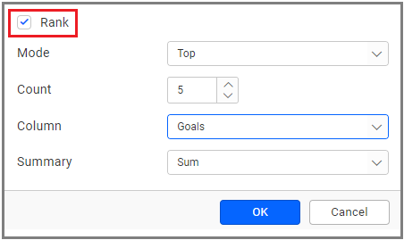
After clicking “OK,” my widget will show the top 5 goal scorers in the World Cup, along with their attempts on target. Here, I can see the values by hovering over the widget.

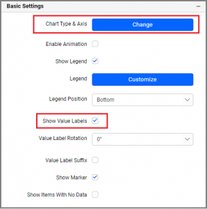
With the help of the “Properties” column, I can see the number of goals scored and the number of attempts by enabling “Show Value Labels” in “Basic Settings.”
Also, I can change the chart type and axis type using the “Change” button in “Basic Settings.”
Here, I would like to change the chart type for my Primary Value(s) to “Line.”
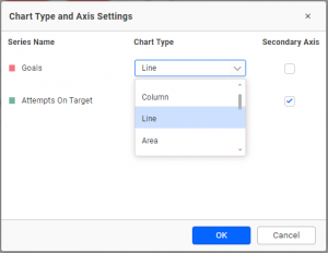
After clicking “OK,” my widget shows line graphs detailing the top 5 goal scorers with their numbers of attempts in the World Cup.

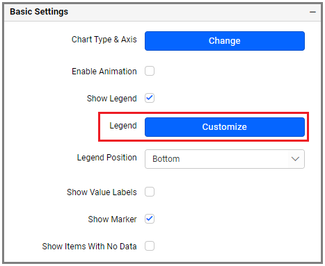
Also, I can customize the name and position of the Legend under “Basic Settings” in the “Properties” column.
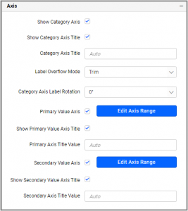
Under the “Axis” section in the “Properties” column, I can customize axis settings like Show or Hide Axis Title, Edit Axis Range, and Label Rotation.
Showcasing Trends and Conditional Formatting
Now, I am going to add a trendline to my widget so I can see the trend of the data, which will be indicated with a single line. Here, I can add, edit, and delete the trendline.I know I can add more than one trendline to Cartesian charts other than bar, series (line, column, area, and spline), and stacked charts.
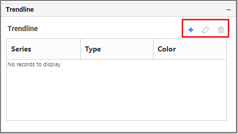
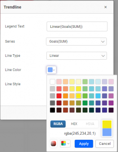
After clicking the “Add” button, a dialog opens where I can customize the trendline.
Now my widget shows the trend you see below.

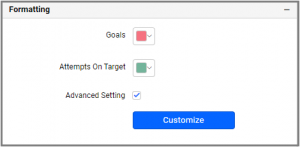
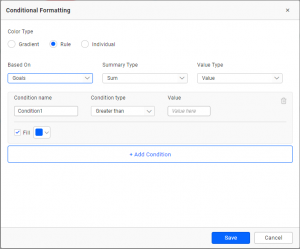
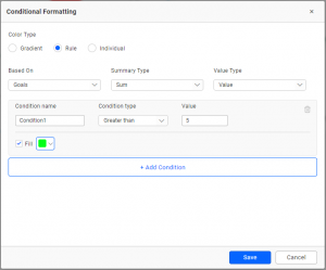
Next, I would like to explore conditional formatting in the combo chart. With this feature, I can modify the chart’s colors based on certain conditions.
The conditional formatting option is available in the “Formatting” section of the “Properties” column. Enable “Advanced Setting” to add conditions and formatting in the dialog.
The conditional formatting dialog even allows me to add a condition based on a completely different field than the one already configured. I can also choose various condition types and formatting options as shown in the following image.
The following example will help to show a combo chart with varying colors based on the condition provided for goals scored by top 5 players.
Now that this formatting has been applied, you can see the updated widget below.