How to Create a Radar Polar Chart Widget?
Getting Started with Radar Polar Chart Widget
If you are a Bold BI Cloud user, log in to your cloud site account. If you are an Embedded BI user, open the Bold BI application installed on your server.Click the “New Dashboard” button and select the “Blank Dashboard” option. A pop-up box will prompt you to configure a data source.
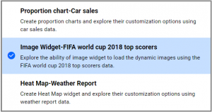
Bold BI has a great variety of sample data sources to choose from, and for this dashboard, I am selecting our “Image Widget-FIFA world cup 2018 top scores” data source.
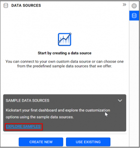
Simply select the data source you would like to use and click “Add”.
Selecting the Radar Polar Chart Widget
Once you have chosen a data source, you can start selecting widgets. For this post, I am going to create a Radar Polar Chart widget.Radar Polar Chart allows you to display multivariate data in the form of a two-dimensional chart using three or more quantitative variables represented on axes starting from the same point.
Assigning data to the Radar Polar Chart Widget
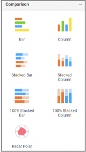
First, I need to drag the Radar Polar widget from the “Comparison” section of the widget menu to my dashboard. Then, I am going to resize the widget by dragging its edges so that it will be easy to read.I know that Radar Polar chart allows me to quickly and easily visualize certain pieces of data in the form of two-dimensional chart.
Thus, in this widget, I would like to compare the performance of each player based on the matches that the players played and attained goals in world cup.
To assign data to my widget, I need to click the “Settings” button in the upper right corner of my widget. Then, I will click the “Assign Data” tab.
I immediately see two columns. In the left column, I can select different fields called “Measures” and “Dimensions.” I can drag these fields to the “Value(s)” “Column” and “Tooltip” boxes in the right column.
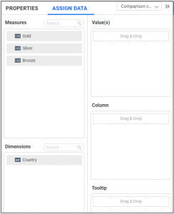
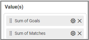
To compare the performance of each player, I need to drag the “Goals” and “Matches” fields to the “Value(s)” box and the “PlayerName” field to the “Column” box.

Customizing the Radar Polar Chart Widget
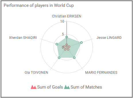
Now that I have assigned data to my widget, I am going to click the “Properties” tab to customize it. First, I am going to change the widget’s name from “RadarPolarChart1” to “Performance of players in World Cup”.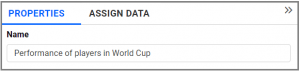
I would like to visualize the performance of the players who comes under Top 5 Ranking. To achieve this, I can “Edit” Filter(s) option in Column “Settings” menu.
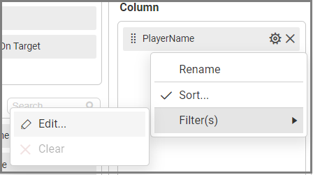
When I click the “Edit” option, a dialog will open and in that I am going to enable “Rank” and choose the Count as ’5’ for the Rank Column.
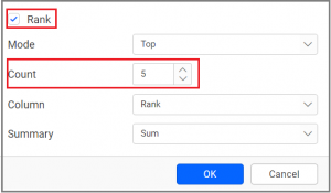
After clicking “OK”, my widget will show the Top 5 Players performance in world cup.
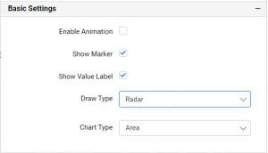
With the help of properties column, I can make few additional changes to my widget. First, I would like to change my widget draw type as “Radar”. Second, I would like to see the medals received by each country without hovering over the Country name. This can be achieved by choosing the Draw Type as “Radar” and by enabling the “Show Value Label” under the “Basic Settings”.
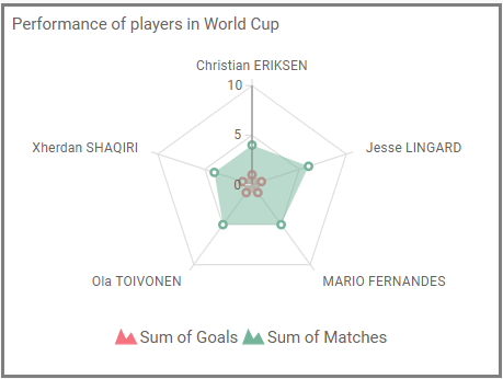
Now, my widget looks the way I want it to look; it displays the player’s performance with Radar visualization.
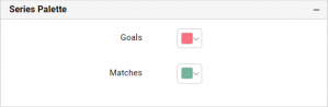
Under the “Properties” column, I can change the color of the Legend name by changing it in a “Series Palette” section.
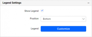
Also, I can customize the name and position of the Legend under “Legend Settings” in the “Properties” column.