How to Create a Pivot Grid Widget
Getting Started with a Pivot Grid Widget
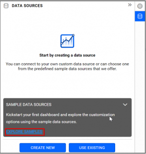
If you are a Bold BI Cloud user, log in to your cloud site account. If you are an Embedded BI user, open the Bold BI application installed on your server.Click the “New Dashboard” button and select the “Blank Dashboard” option. A pop-up box will prompt you to configure a data source.
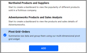
Bold BI has a great variety of sample data sources to choose from, and for this dashboard, I am selecting our “Pivot Grid-Orders” data source.
Simply select the data source you would like to use and click “Add”.
Selecting the Pivot Grid Widget
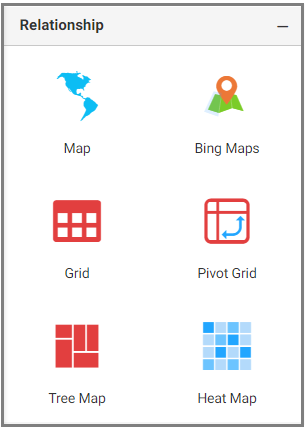
Once you have chosen a data source, you can start selecting widgets. For this post, I am going to create a pivot grid widget.Pivot grid widgets summarize business data and display the results in a cross-table format. They allow the creation of multidimensional views and make it easy for business users to analyze their data.
Assigning Data to the Pivot Grid Widget
First, I need to drag the pivot grid widget from the “Relationship” section of the widget menu to my dashboard. Then, I am going to resize the widget by dragging its edges so that it will be easy to read.I know that pivot grid widgets allow me to display data in multidimensional views for easy analysis.
In this widget, I would like to see the unit price of each product shipped by year so I can see how much money I earned yearly for each product.
To assign data to my widget, I need to click the “Settings” button in the upper right corner of the widget. Then, I will click the “Assign Data” tab.
I immediately see two columns. In the left column, I can select different fields called “Measures” and “Dimensions.” I can drag these fields to the “Value(s),” “Row(s),” and “Column(s)” boxes in the right column.
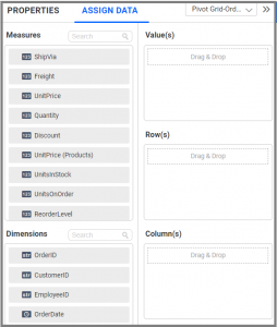
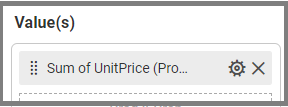
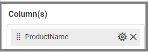
Now, I am going to drag “UnitPrice (Products)” to the “Value(s)” box, “ProductName” to the “Column(s)” box, and “ShippedDate” to the “Row(s)” box.

Customizing the Pivot Grid Widget
Now that I have assigned data to my widget, I am going to click the “Properties” tab to customize it. First, I am going to change the widget’s name from “PivotGrid1” to “Unit price of each product”.
I would like to see the value in dollars, so I am going to apply this format in the “Value(s)” box under the “Settings” menu.
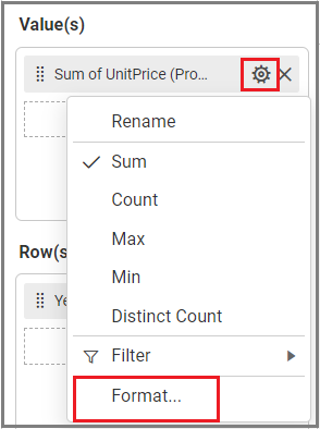
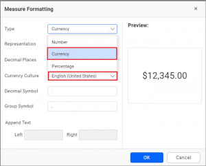
Now I am going to click the “Format” option, and the “Measure Formatting” dialog will be opened. In that dialog, I will choose “Currency” as “Type.” I can then see a preview.
Now, my widget looks like the grid below.
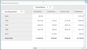
The pivot grid widget has many unique features, and I would like to explore the features below to further customize my widget.
- Adding one or more rows and columns
- Grand totals and subtotals of columns and rows
- Preserving Node States
- Showing No Data Item
- Conditionally formatting in the pivot grid
- Linking URLs for field values
Adding One or More Rows and Columns
In the pivot grid widget, we can group the data for better analysis by adding one or more rows, columns, or both.Each row or column value acts as a group with respective aggregated values while grouping. In multiple groups, each row or column value is arranged as a nested level, forming a hierarchy.
Here, I am going to drag and drop one more field, “ShipName,” to the “Row(s)” box, and “ShipRegion” to the “Column(s)” box.
Now, my widget looks like the grid below with grouping.
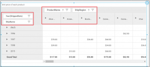
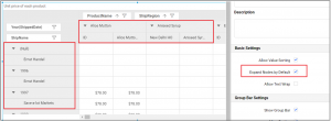
I would like to expand each node in a row and column, so I am going to enable the “Expand Nodes by Default” option in “Basic Settings” under the “Properties” column.
Grand Total and Subtotal Fields in Pivot Table
Totals are the sum of row or column values in the pivot table. I know that the pivot grid widget allows me to get the grand totals of rows and columns. Similarly, it allows me to get the subtotals of each row group and each column group.Here, the grand totals for rows are displayed at the bottom of the pivot table below all rows.
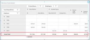
Show Row Grand Totals Text property enables users to change the text displayed for row grand totals. The default text is “Grand Total.” Modifying the text in the designated text box will update the display accordingly.
Grand totals for columns are displayed at the right of the pivot table at the end of all columns.
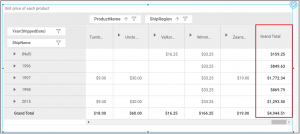
Show Column Grand Totals Text property enables users to change the text displayed for column grand totals. The default text is “Grand Total.” Modifying the text in the designated text box will update the display accordingly.
Here, subtotals for rows are displayed at the bottom of each row group.
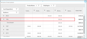
Subtotals for columns are displayed at the right of each column group.
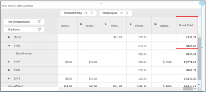
These rows and columns are enabled by default, but I can disable them in Grand Totals Settings under the “Properties” column.
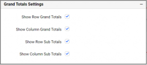
NOTE: The row and column grand totals text boxes are set to Auto by default, which uses the localized Grand Total text from the locale file for display. This allows us to modify the column grand totals text in multiple pivot grids simultaneously using localized text and localization.
Preserving Node States
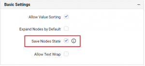
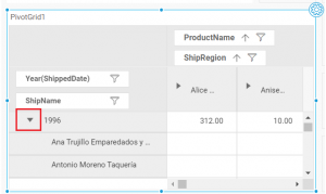
By default, the expanded state of nodes in a pivot table will not be maintained while viewing the dashboard.But with the pivot grid widget in Bold BI, this is possible through enabling Save Nodes State in Basic Settings in the Properties column.
Using this feature, you can focus on specific categories, expand only specific nodes, and perform dynamic operations like sorting and filtering.
Showing No Data Items
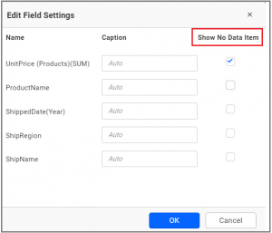
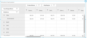
By default, the pivot table shows a row or column item only if there is data in that specific row and column combination. However, I would like to see the row and column items without data.Here, the pivot grid widget allows me to enable Show No Data Item for corresponding fields in the Edit Field Settings under the “Properties” column.
Conditional Formatting in the Pivot Grid
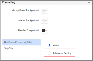
Conditional formatting in the pivot grid allows me to customize the font style, text representation, font color, and fill color based on certain conditions.The conditional formatting option is available in the Formatting section of the “Properties” column. Enable Advanced Setting, and the formatting dialog will open.
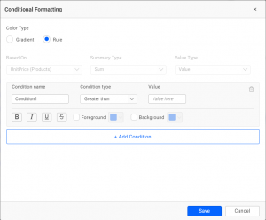
The conditional formatting dialog even allows me to add a condition based on a completely different field than the one already configured. I can also choose various condition types and formatting options as shown in the following image.
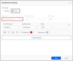
Now, I would like to highlight the “UnitPrice” which is greater than 1000 with respect to “ShipCity.” I added the condition as you can see below.
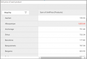
Now, my widget highlights the value based on this condition.
Linking URLs and Parameters to Fields
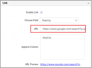
Linking plays an important role in interactive data visualization for analysis. With this functionality, a row or column header cell or value cell in a pivot grid can be linked to relevant content hosted at a URL.Here, I can click the “Enable Link” check box under Link settings in the “Properties” column. I would like to add the URL for “ShipCity,” so I am going to enter “https://www.google.com/search?q={{:ShipCity}}” in the “URL” text box.
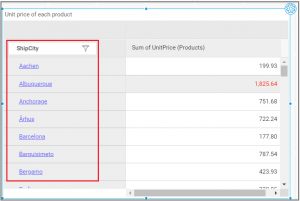
Now, “ShipCity” is linked with the URL in my widget. I can check this by clicking on the city name.
Sorting Values in a Pivot Grid
In the pivot grid widget, we can sort the values by clicking the value column header. It will display the values in ascending or descending order.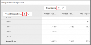
This option can be disabled through the “Allow Value Sorting” option under “Group Bar Settings” in the “Properties” Column.

