How to Create a KPI Card Widget
Getting Started with a KPI Card Widget
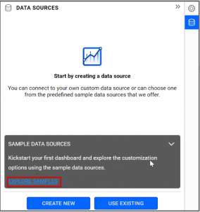
If you are a Bold BI Cloud user, log in to your cloud site account. If you are an Embedded BI user, open the Bold BI application installed on your server.Click the “New Dashboard” button and select the “Blank Dashboard” option. A pop-up box will prompt you to configure a data source.
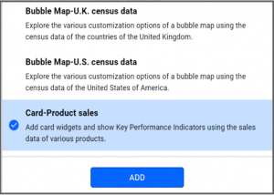
Bold BI has a great variety of sample data sources to choose from, and for this dashboard, I am selecting our “Card-Product Sales” data source.
Simply select the data source you would like to use and click “Add”.
Selecting the KPI Card Widget
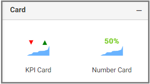
Once you have chosen a data source, you can start selecting widgets. For this post, I am going to create a KPI Card widget.KPI Cards allow you to measure trends by comparing values and goals. For example, you could compare revenue vs investment, target vs current value, or stock vs demand.
Assigning Data to the KPI Card Widget
First, I need to drag the KPI Card widget from the “Card” section of the widget menu to my dashboard. Then, I am going to resize the widget by dragging its edges so that it will be easy to read.I know that KPI Card widget allows me to quickly and easily compare certain pieces of data (such as my sales goal versus my actual sales for the month). I also know that, while I obviously want to sell as many of my products as possible, those sales do not do me much good if my customers are not paying for their orders.
Thus, in this widget, I would like to contrast the total dollar amount of my overall sales with the total dollar amount of payments I have received. This will allow me to see how much money I have received from customers and how much I still need to collect.
To assign data to my widget, I need to click the “Settings” button in the upper right corner of my widget. Then, I will click the “Assign Data” tab.
I immediately see two columns. In the left column, I can select different fields called “Measures” and “Dimensions.” I can drag these fields to the “Actual Value,” “Target Value,” and “Series” boxes in the right column.
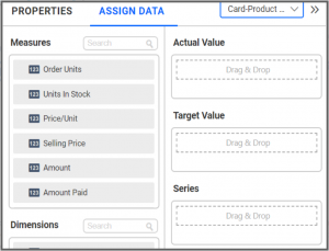
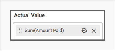
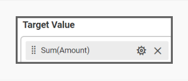
I want to compare the total dollar amount of payments I have received with the total dollar amount of payments I am owed. To do this, I need to drag the “Amount Paid” field to the “Actual Value” box and the “Amount” field to the “Target Value” box.
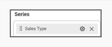
Finally, I am going to drag the “Sales Type” field to the “Series” box. In this case, all my sales are online, but it is still useful to add this field. For one thing, my widget now specifically notes that these numbers represent online sales, and for another, if I ever add another type of sale to my data source, my widget will be updated accordingly.
Customizing the KPI Card Widget
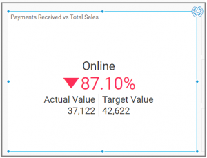
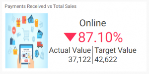
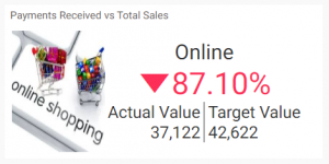
Now that I have assigned data to my widget, I am going to click the “Properties” tab to customize it. First, I am going to change the widget’s name from “Sum of Amount Paid vs Sum of Amount” to “Payments Received vs Total Sales”.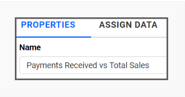
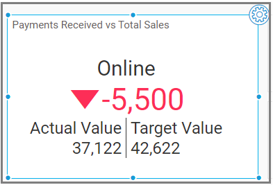
Now, the widget shows the following information:
My Sales type (online)
The dollar amount of payments I have received ($37,122)
The dollar amount of total sales ($42,622)
The dollar amount of payments I have not received ($5,500)
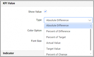
Configuring the KPI Card Widget with a KPI Value
Under the “KPI Value” column in the “Properties” panel, we can change the KPI formula to compare actual and target values. The available formulas are:- Absolute Difference
- Percent of Target
- Percent of Change
- Percent of Difference
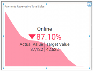
I have decided to use the “Percent of Target” type as I would like to easily see the percentage value of sales for which I have received payment. My completed card widget looks like this.
As I continue to scroll down the “Properties” column, I see a section titled “Indicator”. In this section, I can choose the type of indicator, along with its placement, position, and color.
Then, I can apply the above KPI formulas to the left and right values and can customize them by changing the font size, color, and caption properties.
Showcasing Trends and Patterns
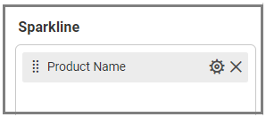
In the “Assign Data” tab, there is a column named “Sparkline”. This section allows you to identify many trends at once according to more narrow criteria.For example, I would like to see the payments I have received for each product category, so I am going to drag and drop the “Product Name” column in the Sparkline section.
Here is my widget showing the payment variations based on the product category.
Adding Images to the KPI Card
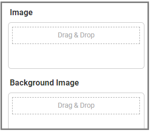
Now, I am going to configure image data for the KPI Card widget. I can add an image using several different methods that are outlined below.In the “Assign Data” tab under the Image and Background Image boxes, I can bind an image field from my data source.
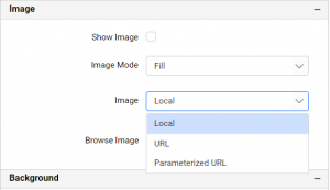
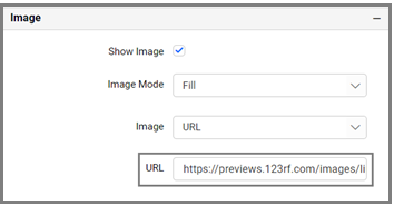
In the “Properties” tab, I can browse images from my local system, bind a URL from my data, or build a parameterized URL.
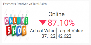
Now, I am going to bind an image field in the image box. I can see the image for the sales type “online” in my widget.
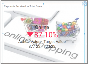
I can also add the image by using the “Properties” tab. Further, this option allows me to add an image to my widget even if I do not have it in my data source. So, let me see how this can be achieved.
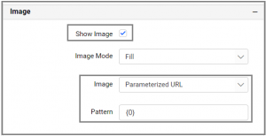
When I scroll down the “Properties” window, I find the Image section. Here, the “Parameterized URL” image type was selected since we added the field in the Image section. In my data source, I have a single parameter for an image URL. Also, we can add multiple parameters by binding the proper image field with respect to the URL in the Image section.
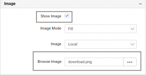
Now, I am going to browse for an image from my local storage by selecting the image type “Local”. Selecting the “Show Image” option will allow me to display the selected image in my widget.
Now, I am going to choose the image type “URL”. Then, I will paste my URL in the text box, and my widget will show the image accordingly.
The Background Image configuration is also the same as the image; thus, my widget will show the image in its background.
Now my widget shows the percentage value of sales for which I have received payment with an interactive image.
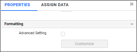
Conditional Formatting in the KPI Card
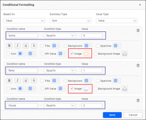
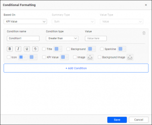
Now, I would like to explore conditional formatting in the KPI Card. With this feature, I can modify various properties such as colors, icons, and images based on certain conditions.The conditional formatting option is available in the Formatting section of the “Properties” panel. Enable Advanced Setting and add conditions and formatting in the dialog.
The conditional formatting dialog even allows me to add a condition based on a completely different field than the one already configured. I can also choose various condition types and formatting options as shown in the following image.
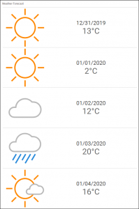
The following example shows a KPI card configured in a series to show the weather forecast for the week. The images are dynamically configured based on weather conditions.