How to Create a Spline or Line Chart Widget
Getting Started with Spline or Line Chart Widget
If you are a Bold BI Cloud user, log in to your cloud site account. If you are an Embedded BI user, open the Bold BI application installed on your server.Click the “New Dashboard” button and select the “Blank Dashboard” option. A pop-up box will prompt you to configure a data source.
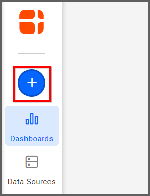
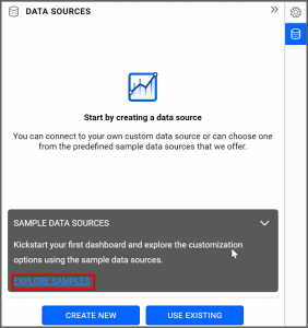
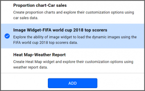
Bold BI has a great variety of sample data sources to choose from, and for this dashboard, I am selecting our 2018 World Cup data source.
Simply select the data source you would like to use and click “Add.”
Selecting the Spline Chart Widget
Once you have chosen a data source, you can start selecting widgets. For this post, I am going to create a spline chart widget.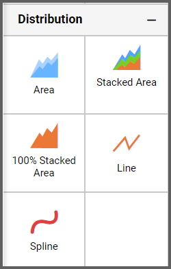
These widgets allow you to showcase trends for analysis over time with data points that are connected using splines.
Assigning the Data to Spline Chart Widget
First, I will drag the widget from the “Distribution” section of the widget menu to my dashboard. Then, I will resize the widget by dragging its edges so that it will be easy to read. This is what my spline chart looks like before I have assigned data to it.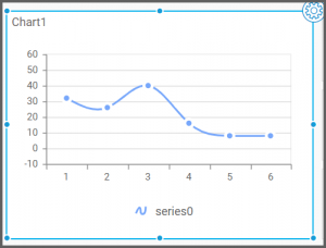
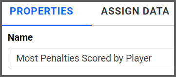
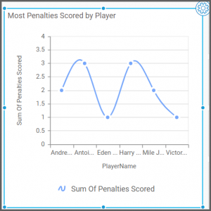
Next, I will click the “Options” button, navigate to the “Properties” tab, and change the name of my widget. I want my widget to show the most penalty goals scored by players in the World Cup, so I will call the spline widget “Most Penalties Scored by Player.”
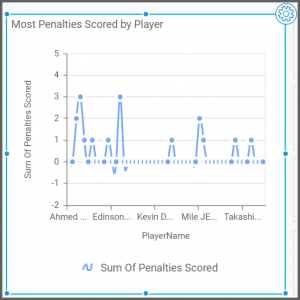
Finally, I will click the “Assign Data” tab. I want my widget to display the number of penalty goals that were scored in the World Cup, so I need to drag the “Penalties Scored” field to the “Values” box.

I want to see the data for individual players (not teams), so I need to drag the “PlayerName” field to the “Columns” box.

My widget has now been created, but given the sheer amount of information it displays, I would like to filter my data to make the widget easier to read
Customizing the Spline or Line Chart Widget
In order to make my widget easier to read, I am going to narrow down the data it displays. I have decided that instead of seeing the statistics for all of the players in the World Cup, I would only like to see data for the six players with the most penalty goals.In order to achieve this, I need to click the “Options” button that appears beside the “PlayerName” field in the “Columns” box and click “Filter(s).”
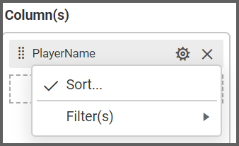
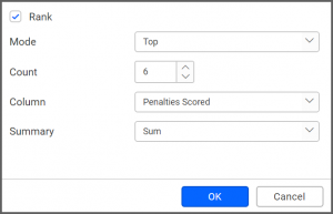
Then, I need to click the “Rank” checkbox, select “Top” from the drop-down list box for the “Mode” option, and change the “Count” option to 6. Finally, I need to change the “Column” drop-down list box to “Penalties Scored.”
Now, I am happy with my spline widget’s appearance, but I would like to customize it so that if I click on a player’s name, I am able to see the name of their team.
To do this, I will enable the multi-level drill down feature. As the name implies, this option will allow me to drill down my data even further by displaying another level of information.
To enable multi-level drill down, I will navigate back to the “Assign Data” tab. Making this customization will require me to modify the data that is associated with players’ names, so I need to locate the “Columns” box.
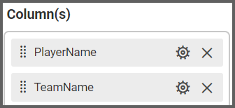
Currently, the only field in the “Columns” box is the “PlayerName” field. If I would like my widget to display the names of the players’ teams, I need to add the “TeamName” field to the “Columns” box.
Thus, I will drag the “TeamName” field to the “Columns” box and place it underneath the “PlayerName” field. When I do this, a box will pop up asking me if I want to enable multi-level drill down.
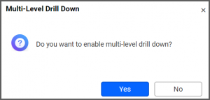
After I click “Yes,” the “Columns” box displays the “PlayerName” field on top of the “TeamName” field. The widget’s appearance has not changed, but multi-level drill down is now enabled. This means that I can click the data points on my spline widget to obtain additional information (in this case, the name of the team that each player represented in the World Cup).
I can test the widget’s functionality by clicking the “Preview” button in the upper right corner of my dashboard, navigating to the spline widget, and hovering over a player’s dot on the widget. White diagonal lines appear within the blue dot, which indicates that I can click the dot to view additional information.
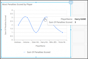
After I click the dot, the player’s data is displayed, and the name of their team appears at the bottom of the widget.
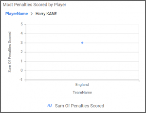
The drill up feature allows you to return to the previous view by clicking on the "PlayerName” in the above widget.
Finally, it is worth noting that if you would like to create a line chart widget, you can do so using exactly the same steps that are outlined above. The only difference between the spline widget and the line widget is that the spline widget uses smooth curves to connect data points while the line widget uses straight lines to connect data points. However, the widgets’ functionalities are the same.
