How to Create an Area Chart Widget
Getting Started with Area Chart Widget
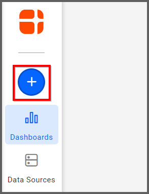
If you are a Bold BI Cloud user, log in to your cloud site account. If you are an Embedded BI user, open the Bold BI application installed on your server.Click the “New Dashboard” button and select the “Blank Dashboard” option. A pop-up box will prompt you to configure a data source.
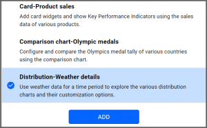
Bold BI has a great variety of sample data sources to choose from, and for this dashboard, I am selecting our “Distribution-Weather Details” data source.
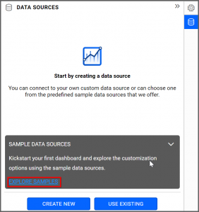
Simply select the data source you would like to use and click “Add.”
Selecting the Area Chart Widget
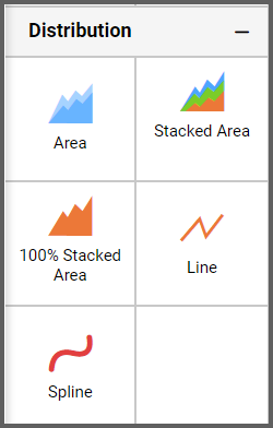
Once you have chosen a data source, you can start selecting widgets. For this post, I am going to create an area chart widget.These widgets allow you to compare values for a set of items through filled vertical curves.
Assigning the Data to Area Chart Widget
First, I need to drag the area widget from the “Distribution” section of the widget menu onto my dashboard. Then, I am going to resize it by dragging its edges so that it will be easy to read. This is what my area widget looks like before I have assigned data to it.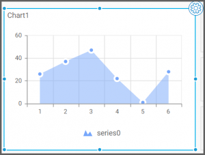
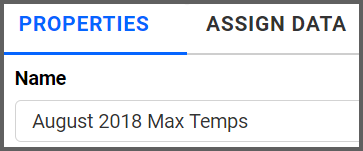
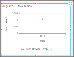
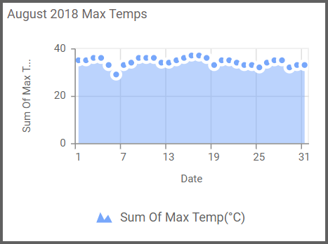
Next, I am going to click the “Settings” button in the upper right corner of the widget. I would like my area chart to display the maximum temperature for each day of August 2018, so I am going to rename my widget accordingly. To do this, I will click the “Properties” tab and type in my area chart’s new name.
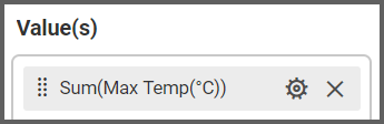
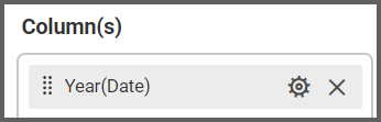
Now, I am ready to assign data to my widget. After clicking the “Assign Data” tab, I will drag the “Max Temp” field to the “Values” box and the “Date” field to the “Columns” box.
Customizing the Area Chart Widget
My widget has now been created, but it looks a bit odd. This is because my data source only contains temperature data for one month, August 2018, but my widget is displaying the date in a year format (rather than showing each individual day of August as I intended).You may have noticed that though the “Dimensions” box contains a field called “Date,” the field’s name changed to “Year(Date)” when you dragged it over to the “Columns” box. This is because the widget shows data for the entire year by default.
This format would be helpful if I were comparing data across multiple years, but since I am only looking at one month of data, I need to revise my date display criteria. It does not make sense for my widget to supposedly display data for all of 2018 if I am only examining one month of temperature data.
To change the date settings for my widget, I need to navigate back to the “Columns” box and click the “Options” button beside the “Year(Date)” field. When I do, I see a list of different date display options: Date Time, Date, Year, Quarter, Month, Day, and More (clicking the “More” button will provide you with additional options).
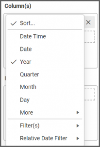
As we noted earlier, the “Year” option is selected by default. In order to see the maximum temperature data for each individual day of the month, I am going to click the “Day” option.
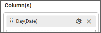
After I click “Day,” I can see that the name of the date field in the “Columns” box has been changed to “Day(Date),” and my widget’s appearance has been updated accordingly.
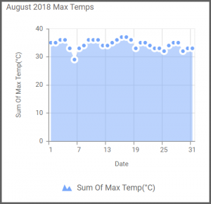
I can change the date increments along the bottom of my area chart by dragging the chart’s edges to resize it. For example, if I make the widget smaller, it will display the dates in increments of six.
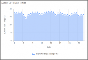
However, if I make the widget larger, it will display the dates in increments of four.
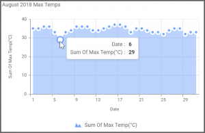
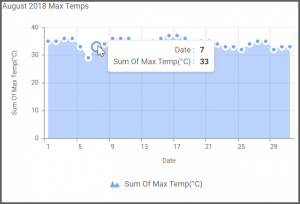
It is also worth noting that I can hover over any dot on the widget to see the maximum temperature data for that date. For example, I can see that the high on August 6 was 29°C and that the high on August 7 was 33°C.