How to Create a Pyramid or Funnel Chart Widget
Getting Started with Pyramid or Funnel Chart Widget
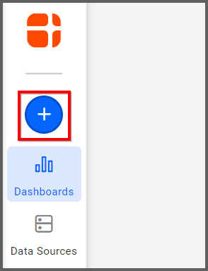
If you are a Bold BI Cloud user, log in to your cloud site account. If you are an Embedded BI user, open the Bold BI application installed on your server.Click the “New Dashboard” button and select the “Blank Dashboard” option. A pop-up box will prompt you to configure a data source.
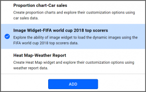
Bold BI has a great variety of sample data sources to choose from, and for this dashboard, I am selecting our 2018 World Cup data source.
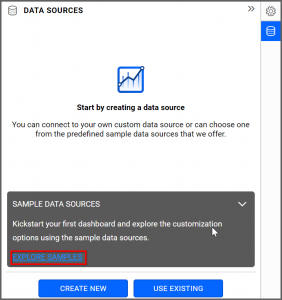
Simply select the data source you would like to use and click “OK.”
Selecting the Pyramid Widget
Once you have chosen a data source, you can start selecting widgets. For this post, I am going to create a pyramid widget.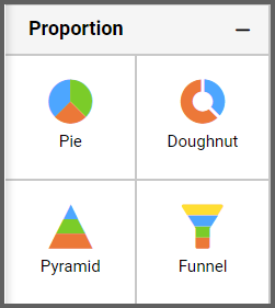
These widgets allow you to highlight the proportional comparison between values in a progressively increasing manner.
Assigning the Data to Pyramid Widget
First, I will drag the widget from the “Proportion” section of the widget menu to my dashboard. Then, I am going to resize it by dragging its edges so that it will be easy to read. This is what my pyramid widget looks like before I have assigned data to it.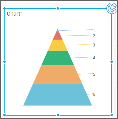
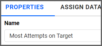
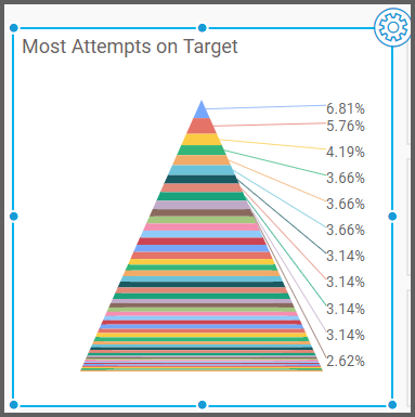
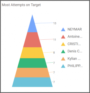
Next, I will click the “Settings” button in the upper right corner of the widget and navigate to the “Properties” tab to rename my widget. I want my pyramid to display each player’s number of attempts on target, so I will call the widget “Most Attempts on Target.”
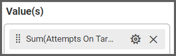
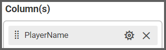
Now, I am ready to assign data to my widget. After clicking the “Assign Data” tab, I will drag the “Attempts On Target” field to the “Values” box. I want to see the data for individual players (rather than teams), so I will drag the “PlayerName” field to the “Columns” box.
My widget has been created, but given the sheer amount of information it displays, it is clear that I need to filter my data to make the widget easier to read.
Customizing the Pyramid or Funnel Chart Widget
To filter my data, I will click the “Options” button that appears beside the “PlayerName” field and click “Filter(s).”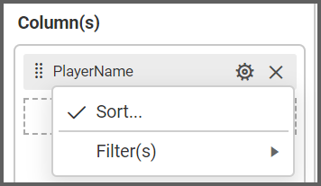
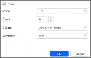
In order to show the six players with the most attempts on target, I need to click the “Rank” checkbox, select “Top” from the drop-down list box for the “Mode” option, and change the “Count” option to 6. Finally, I need to change the “Column” drop-down list box to “Attempts On Target.”
Now, my widget’s data is far easier to read; however, I would like to make a few additional changes.
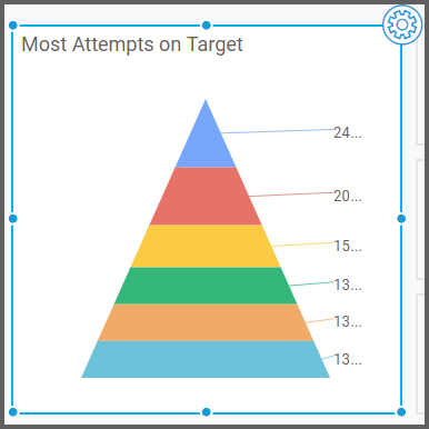
First, I would like to replace the percentage values on my widget with numeric values. Second, I would like to make my widget display a legend so I can see which color represents which player without hovering over the player’s pyramid segment. I can make both of these modifications in the “Properties” tab.
After I click the widget’s “Options” button and navigate to the “Properties” tab, I see a section titled “Basic Settings.”
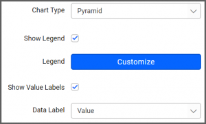
In this section, I can click the checkbox beside the “Show Legend” option to make my widget display a guide demonstrating which segment color is associated with which player.
I can also change the “Data Label” drop-down list box option to “Value” in order to make my pyramid display numeric values instead of percentages.
Now, my pyramid widget looks the way I want it to look; it displays the numeric value of each player’s assists, and it contains a color-coded legend demonstrating which pyramid segment represents each player.
It is worth noting that if you would like to create a funnel chart widget, you can do so using exactly the same steps that are outlined above. The only difference between the pyramid widget and the funnel widget is that the pyramid widget displays values in a progressively increasing manner while the funnel widget showcases values in a progressively decreasing manner.

