How to Create a Doughnut or Pie Chart Widget
Getting Started with Doughnut or Pie Chart Widget
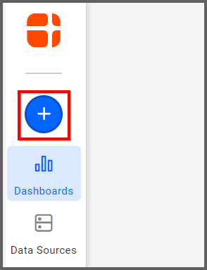
If you are a Bold BI Cloud user, log in to your cloud site account. If you are an Embedded BI user, open the Bold BI application installed on your server.Click the “New Dashboard” button and select the “Blank Dashboard” option. A pop-up box will prompt you to configure a data source.
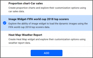
Bold BI has a great variety of sample data sources to choose from, and for this dashboard, I am selecting our 2018 World Cup data source.
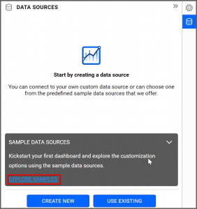
Simply select the data source you would like to use and click “OK.”
Selecting the Doughnut Widget
Once you have chosen a data source, you can start selecting widgets. For this post, I am going to create a doughnut widget.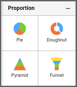
These widgets allow you to highlight the proportional distribution of certain pieces of data in the form of doughnut slices.
Assigning the Data to Doughnut widget
First, I need to drag the doughnut widget from the “Proportion” section of the widget menu onto my dashboard. Then, I am going to resize it by dragging its edges so that it will be easy to read. This is what my doughnut widget looks like before I have assigned data to it.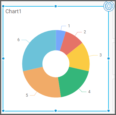
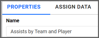
Next, I am going to click the “Settings” button in the upper right corner of the widget. I would like my doughnut widget to display assist data for the World Cup, so I am going to click the “Properties” tab and rename my widget. I want my widget to show data for both teams and individual players (I can achieve this by using the multi-level drill down option, which we will explore later), so I will call it “Assists by Team and Player.”
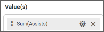
Now, I am ready to assign data to my widget by clicking the “Assign Data” tab. If I would like to see teams’ assist data, I need to drag the “Assists” field to the “Values” box and the “TeamName” field to the “Columns” box.
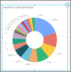
After I drag the “TeamName” field to the “Columns” box, my widget is created, but it looks cluttered because it contains so much information. I will now customize the widget to make its data easier to read.
Customizing the Doughnut Widget
I know that this widget offers the multi-level drill down option, so now that I have organized the data by team, I would like to add a drill-down option that will allow me to see specific players’ data.However, before I add the drill-down option, I would like to filter the existing data to make my widget easier to read.
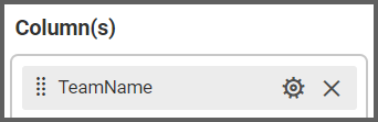
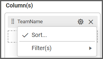
To do this, I simply need to click the “Options” button for the “TeamName” field and click “Filter(s).”
Then, I need to click the “Rank” checkbox, select “Top” from the drop-down list box for the “Mode” option, and change the “Count” option to the desired number. Finally, I need to change the “Column” drop-down list box to “Assists.”
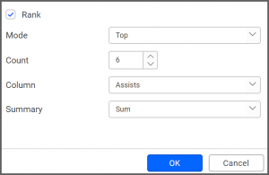
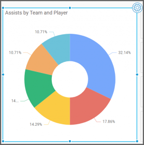
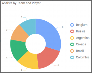
Now, my widget only shows the six teams with the most assists in the World Cup.
Next, I am going to add the multi-level drill down option to my widget. As its name suggests, this function allows me to add another layer of data to my widget.
In this case, I would like to modify my widget so that if I click on a team’s doughnut segment, I can see a breakdown of which players on the team had assists.
Making this customization will require me to change the data that is associated with my doughnut segments, so I need to navigate back to the “Columns” box under the “Assign Data” tab. If I want my widget to display information for players as well as teams, I need to drag the “PlayerName” field to the “Columns” box.
When I try to do so, a pop-up appears asking if I want to enable multi-level drill down.
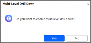
After I click “Yes,” my “Columns” box displays the “PlayerName” field beneath the “TeamName” field, and multi-level drill down has been enabled. We will explore this feature’s functionality soon, but before doing so, I want to ensure that my widget looks the way I want it to look.
Right now, my doughnut’s segments are each associated with a percentage value. Though percentage values can be useful in many situations, they do not really suit my purposes, so I would like to replace them. I would also like to display a key or guide of some sort so that I know which team each color represents without hovering over each segment.
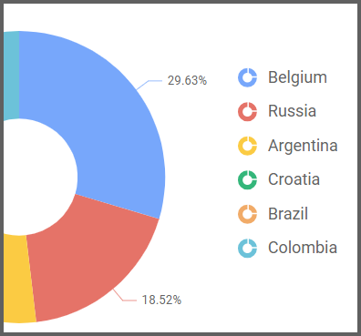
To achieve this, I can click the “Properties” tab. If I scroll down to the “Basic Settings” section, I can click the “Show Legend” option. My doughnut widget immediately displays a guide demonstrating which segment colors are associated with which teams.
I would still like to remove the percentage values from the widget, and in the “Basic Settings” section, I see a drop-down list box called “Data Label.” Currently, the “Percentage” option is selected.
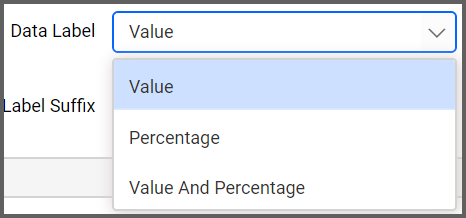
If I select the “Value” option instead, my widget will replace the percentage value with the number of assists that each team has. It is worth noting that you can display both the numeric value and percentage value if you wish, but for this widget, I would only like to display the numeric value.
Now, my widget looks like this.

Now that my widget looks the way I want it to look, I would like to explore the multi-level drill down feature to ensure that it functions properly.
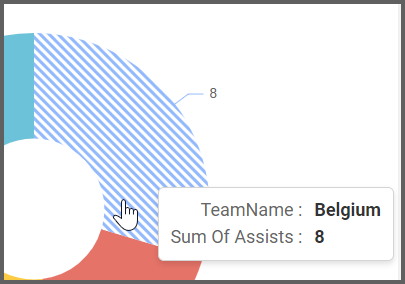
I can test the widget’s functionality by clicking the “Preview” button in the upper right corner of my dashboard and navigating to the doughnut widget. If I hover over a doughnut segment, I see the name of the team and the team’s total number of assists. The diagonal lines indicate that I can click the segment to view additional information.
If I click on Belgium’s segment, I can see individual Belgian players’ total numbers of assists. The drilled-down widget display also contains a legend demonstrating which segment color is associated with which player.
Multi-level drill down is available with 15 different Bold BI widgets. All of the widgets in the Comparison, Proportion, and Distribution sections of the widget menu offer this feature, allowing you endless customization options.
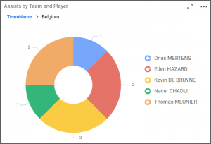
The drill up feature allows you to return to the previous view by clicking on the “TeamName” in the above widget.
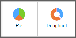
Finally, it is worth noting that if you would like to create a pie chart widget, you can do so using exactly the same steps that are outlined above. The only difference between the doughnut widget and the pie chart widget is that the pie widget does not have a white circle in its center, so its segments have a slightly different appearance (as you can see in the screenshot to the right). However, the widgets’ functionalities are the same.