How to Create a Card Widget
Getting Started with Card Widget
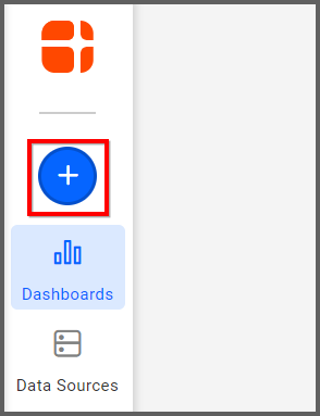
If you are a Bold BI Cloud user, log in to your cloud site account. If you are an Embedded BI user, open the Bold BI application installed on your server.Click the “New Dashboard” button and select the “Blank Dashboard” option. A pop-up box will prompt you to configure a data source.
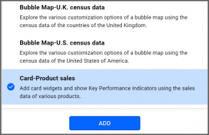
Bold BI has a great variety of sample data sources to choose from, and for this dashboard, I am selecting our “Card—Product Sales” data source.
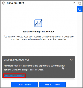
Simply select the data source you would like to use and click “Add.”
Selecting the Card Widget
Once you have chosen a data source, you can start selecting widgets. For this post, I am going to create a card widget.These widgets allow you to measure trends through key performance indicators, such as actual values and target values.
Assigning the Data to Card Widget
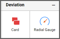
First, I need to drag the card widget from the “Deviation” section of the widget menu to my dashboard. Then, I am going to resize the widget by dragging its edges so that it will be easy to read. This is what my card widget looks like before I have assigned data to it.I know that card widgets allow me to quickly and easily compare certain pieces of data (such as my sales goal versus my actual sales for the month). I also know that, while I obviously want to sell as many of my products as possible, those sales do not do me much good if my customers are not paying for their orders.
Thus, in this widget, I would like to contrast the total dollar amount of my overall sales with the total dollar amount of payments I have received. This will allow me to see how much money I have actually received from customers and how much I still need to collect.
To assign data to my widget, I need to click the “Settings” button in the upper right corner of my widget. Then, I will click the “Assign Data” tab.
I immediately see two columns. In the left column, I can select different fields called “Measures” and “Dimensions.” I can drag these fields to the “Actual Values,” “Target Values,” and “Series” boxes in the right column.
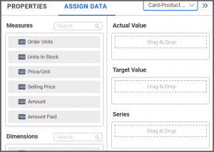
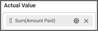
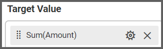
I want to compare the total dollar amount of payments I have received with the total dollar amount of payments I am owed. To do this, I need to drag the “Amount Paid” field to the “Actual Values” box and the “Amount” field to the “Target Values” box.
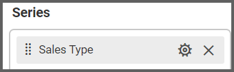
Finally, I am going to drag the “Sales Type” field to the “Series” box (we will explore what happens if you add the “Product Name” field to the “Series” box later).
In this case, all of my sales are online, but it is still useful to add this field. For one thing, my widget now specifically notes that these numbers represent online sales, and for another, if I ever add another type of sale to my data source, my widget will be updated accordingly.

Customizing the Card Widget
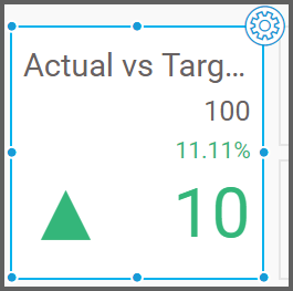
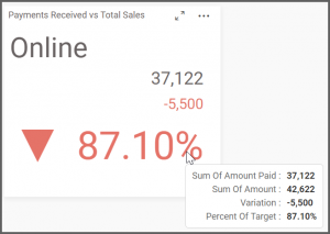
Now that I have assigned data to my widget, I am going to click the “Properties” tab to customize it. First, I am going to change the widget’s name from “Sum of Amount Paid vs Sum of Amount” to “Payments Received vs Total Sales.”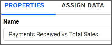
Next, I will scroll down to the “Basic Settings” section and locate the “Secondary Value Type” drop-down list box. Selecting the “Variation” or the “Target Value” option will change my widget’s appearance.
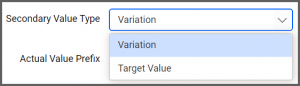
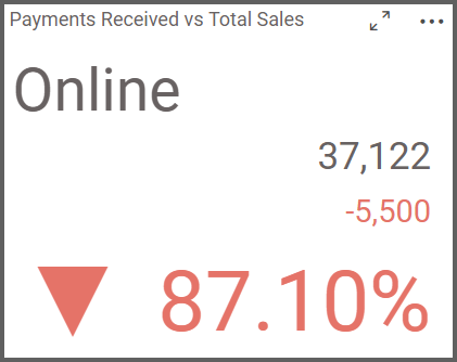
“Variation” is selected by default. When this option is selected, the widget shows the following information:
- The dollar amount of payments I have received ($37,122)
- The dollar amount of payments I have not received ($5,500)
- The percentage of total sales dollars for which I have received payment (87.1%)
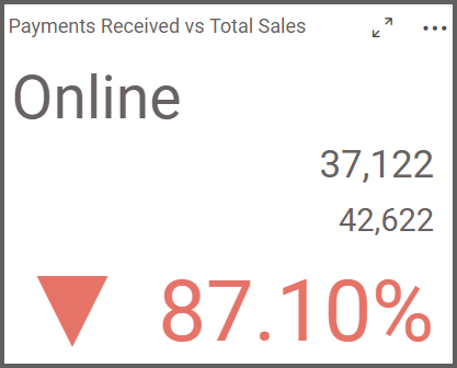
- The dollar amount of payments I have received ($37,122)
- The dollar amount of total sales ($42,622)
- The percentage of total sales dollars for which I have received payment (87.1%)
As I continue to scroll down the “Properties” column, I see a section titled “Behavior.” In this section, I can choose whether I would like a high value to be a positive or negative indicator. The box is checked by default, but if I uncheck it, some of the numbers in my widget will change from red to green.
In this case, a high value would initially seem to be positive; after all, I want to receive payment for my sales, so if I have received payment for 87% of my sales, that is a good thing. Even so, because I have not received payment for 100% of my sales, I want this number to stay red. Thus, I will leave the box checked.
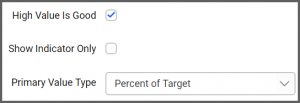
The “Behavior” section also contains a drop-down list box called “Primary Value Type.” By default, the “Percent of Target” option is selected, but selecting different options from this drop-down list box will allow me to further customize my widget by either changing the information it displays or changing the order in which certain pieces of data are arranged.
We will now explore each of the five options in this drop-down list box to see how they alter the card widget’s appearance.
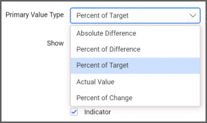
Absolute Difference
If I select the “Absolute Difference” option in the “Primary Value Type” drop-down list box, my widget displays the following information:- The dollar amount of payments I have received ($37,122)
- The percentage of total sales dollars for which I have not received payment (12.9%)
- The dollar amount of payments I have not received ($5,500)
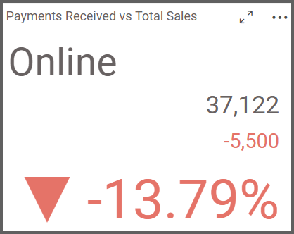
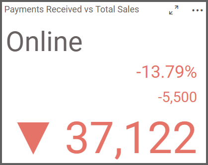
Percent of Difference
If I select the “Percent of Difference” option in the “Primary Value Type” drop-down list box, my widget displays the following information:- The dollar amount of payments I have received ($37,122)
- The dollar amount of payments I have not received ($5,500)
- The percentage of total sales dollars for which I have not received payment (13.79%)
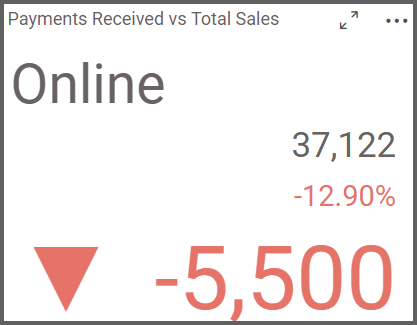
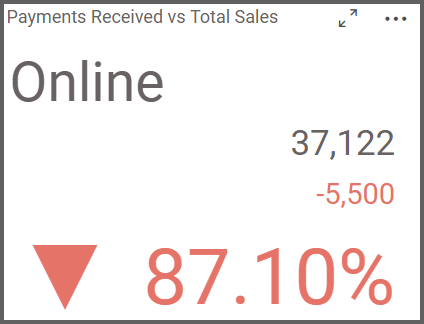
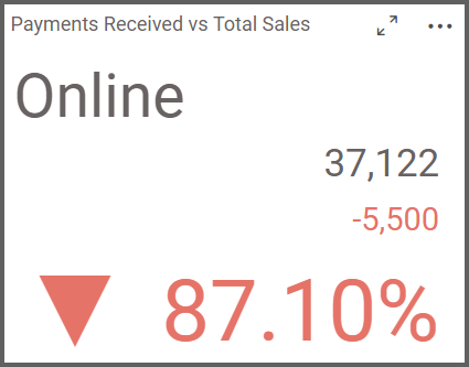
Percent of Target
If I select the “Percent of Target” option in the “Primary Value Type” drop-down list box, my widget displays the following information:- The dollar amount of payments I have received ($37,122)
- The dollar amount of payments I have not received ($5,500)
- The percentage of total sales dollars for which I have received payment (87.1%)
Actual Value
If I select the “Actual Value” option in the “Primary Value Type” drop-down list box, my widget displays the following information:- The percentage of total sales dollars for which I have not received payment (13.79%)
- The dollar amount of payments I have not received ($5,500)
- The dollar amount of payments I have received ($37,122)
Percent of Change
If I select the “Percent of Change” option in the “Primary Value Type” drop-down list box, my widget displays the following information:- The dollar amount of payments I have received ($37,122)
- The dollar amount of payments I have not received ($5,500)
- The dollar amount of payments I have not received ($5,500) divided by the dollar amount of payments I have received ($37,122), which is 12.90%.
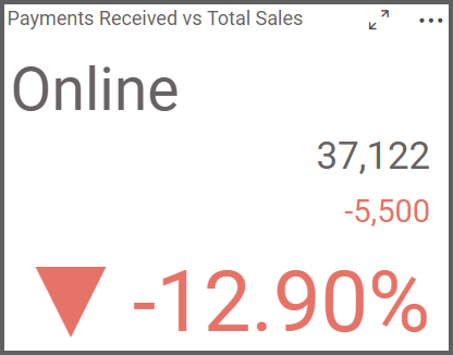
This percentage value represents the difference between the “Sum(Amount)” and the “Sum(Amount Paid)” fields divided by the “Sum(Amount Paid)” field. Though it is not particularly useful for my purposes, it is worth keeping in mind in case you would like to use it in the future.
Now that I have seen the five different display options that are available for my card widget, I need to choose the one that is the best fit for my needs. I know that the “Percent of Change” option is not the best fit for the information I want to present, so I essentially have four options.
I can choose to emphasize the total amount of outstanding payments as either a numeric value or a percentage value ($5,500 or 12.9%). The “Absolute Difference” and “Percent of Difference” options would allow me to do this.
Alternatively, I can choose to highlight the total amount of payments I have received as either a numeric value or a percentage value ($37,122 or 87.1%). The “Percent of Target” and “Actual Value” options would allow me to do this.
I have decided to use the “Percent of Target” primary value type as I would like to easily see the percentage value of sales for which I have received payment. My completed card widget looks like this.
It is also worth noting that no matter which customization options you choose, you can always hover over your widget to obtain the key pieces of information you have chosen to display.
In this case, I can hover over my widget to see the dollar amount of payments I have received, the dollar amount of total sales, the dollar amount of payments I have not received, and the percentage of sales for which I have received payment.
Though my card widget now displays the information I want to highlight, there is one additional customization I can make so that the information will be even more detailed.
Right now, the widget shows my total sales numbers. This is because when I assigned data to the widget, I moved the “Sales Type” field into the “Series” box. Thus, my data is technically sorted by sales type, but as all of my sales are online sales, there is only one category. This means that the card widget simply shows the total amount of all of my sales.
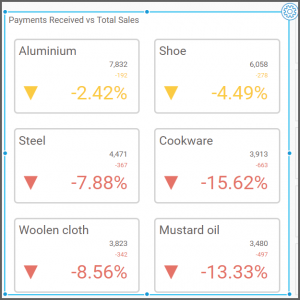
However, if I add the “Product Name” field to the “Series box,” my data will be sorted according to the different products I offer.
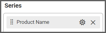
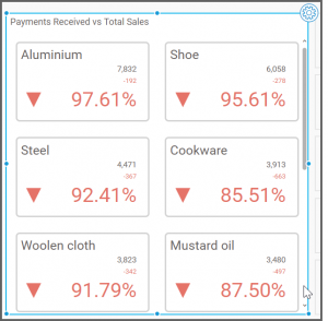
After I drag the “Product Name” field to the “Series” box, my card widget immediately changes its appearance. It still displays the same information (the information I selected when I chose the “Percent of Target” primary value type). Now, however, the widget sorts the data by product.
I can now see the dollar amount of payments received, the dollar amount of outstanding payments, and the percentage values of sales dollars for which I have received payment for each product category.
If I would like to change anything else about my widget’s appearance—if I would like to change the color of high values from red to green, for example, or if I would like to update the primary or secondary value type drop-down list boxes to change the information that the widget displays—I need only click the “Properties” tab and follow the steps that we previously reviewed.
As a final example, let us say that I would like to change the “Primary Value Type” field from “Percent of Target” to “Percent of Difference.”
After I select “Percent of Difference” from the “Primary Value Type” drop-down list box, I am going to resize my widget by dragging its edges so that I can see all of my data without having to scroll.
In each product’s rectangle, I can see the dollar amount of payments received, the dollar amount of outstanding payments, and the percentage values of sales dollars for which I have not received payment for each product category.

