How to Create a Tree Map Widget
Getting Started with Tree Map Widget
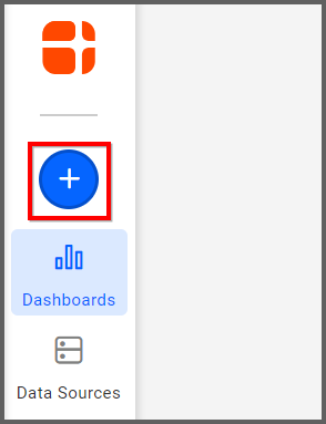
If you are a Bold BI Cloud user, log in to your cloud site account. If you are an Embedded BI user, open the Bold BI application installed on your server.Click the “New Dashboard” button and select the “Blank Dashboard” option. A pop-up box will prompt you to configure a data source.
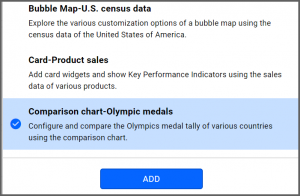
Bold BI has a great variety of sample data sources to choose from, and for this dashboard, I am selecting our “Comparison Chart—Olympic Medals” data source.
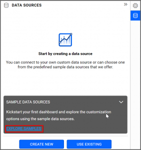
Simply select the data source you would like to use and click “Add.”
Selecting the Tree Map Widget
Once you have chosen a data source, you can start selecting widgets. For this post, I am going to create a tree map widget.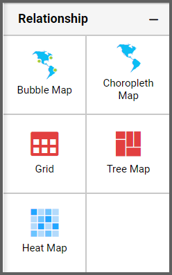
These widgets allow you to display large amounts of data as clustered rectangles with a color scale.
Assigning the Data to Tree Map Widget
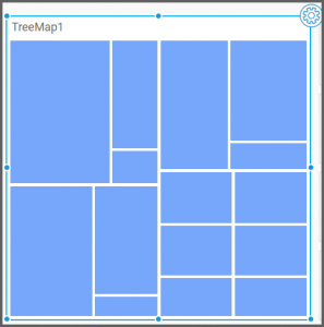
First, I need to drag the tree map widget from the “Relationship” section of the widget menu onto my dashboard. Then, I am going to resize it by dragging its edges so that it will be easy to read. This is what my tree map widget looks like before I have assigned data to it.Next, I will click the “Settings” button in the upper right corner of the widget and click the “Assign Data” tab.
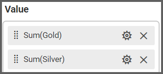
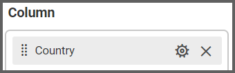
I would like my widget to display the gold and silver medals earned by each country, so I will drag the “Gold” and “Silver” fields to the “Values” box and the “Country” field to the “Columns” box.
My tree map has now been created, but it is a bit difficult to read due to the sheer amount of data it displays. Thus, I am going to filter my data to make my widget more manageable.
Customizing the Tree Map Widget
I would like my tree map to display data for the 15 countries that earned the most gold medals. To filter my data, I need to click the “Options” button that appears beside the “Country” field in the “Columns” box. I can then click “Filter(s).”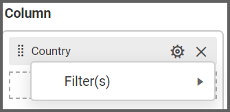
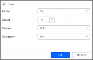
Next, I need to click the “Rank” checkbox, select the “Top” option from the “Mode” drop-down list box, change the “Count” option to 15, select the “Gold” option from the “Column” drop-down list box, and click “OK.” Now, my tree map only displays data for the 15 teams that earned the most gold medals.
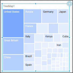
Note: As you create your tree map, you may notice that some rectangles are not displaying the information they should. For example, in the screenshot to the right, five of the rectangles are not displaying countries’ names.
At the widget’s current size, there is not room in these rectangles to display the countries’ names. To fix this issue, simply resize your widget by dragging its edges.
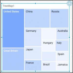
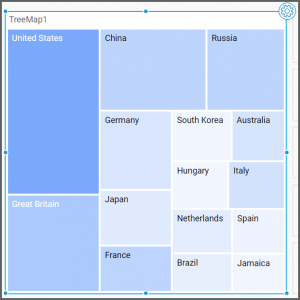
As you can see, each rectangle displays a country name in the resized widget.
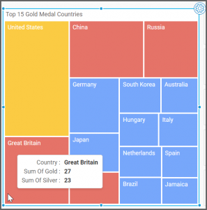
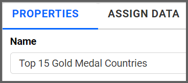
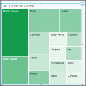
Now that my tree map displays the data I want it to display, I can click the “Properties” tab to further customize the widget. First, I am going to change the widget’s name from “TreeMap1” to “Top 15 Gold Medal Countries.”
Then, I am going to scroll down to the “Range Color Settings” section to explore my color scheme options.
The “Color Type” drop-down list box offers two options: “Monochromatic” (which is selected by default) and “Range Color.”
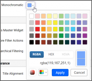
If the color type is set to monochromatic, I can click the arrow in the “Monochromatic” box to change the tree map’s color. I can choose a preselected color, or I can click the “Switcher” box in the lower left corner to create a custom color.
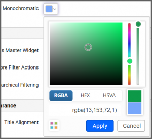
For example, I could change my tree map color to a custom shade of green.
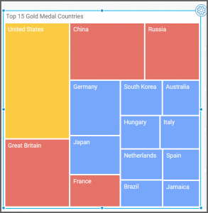
Alternatively, I can change the “Color Type” drop-down list box to “Range Color.” Now, the widget will assign different colors to different ranges of data in the tree map.
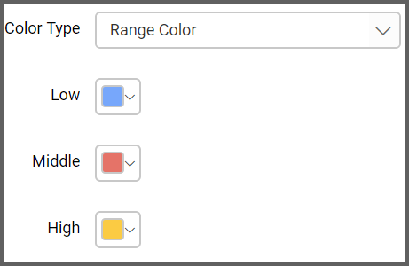
By default, the rectangle with the highest value will be yellow. Rectangles in the middle of the value range will be red, and rectangles at the low end of the value range will be blue.
You can easily change the colors for the low, middle, and high value ranges by clicking the arrows in their respective boxes (just as I did when I changed the tree map’s color from blue to green when the color type was set to monochromatic).
Finally, I am going to test my widget’s functionality. Whether I set the “Color Type” drop-down list box to “Range Color” or “Monochromatic,” I will be able to see the data for any given country by hovering over it with my mouse.