How to Create a Heat Map Widget
Getting Started with Heat Map Widget
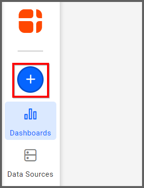
If you are a Bold BI Cloud user, log in to your cloud site account. If you are an Embedded BI user, open the Bold BI application installed on your server.Click the “New Dashboard” button and select the “Blank Dashboard” option. A pop-up box will prompt you to configure a data source.
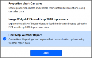
Bold BI has a great variety of sample data sources to choose from, and for this dashboard, I am selecting our “Heat Map-Weather Report” data source.
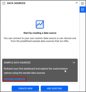
Simply select the data source you would like to use and click “Add.”
Selecting the Heat Map Widget
Once you have chosen a data source, you can start selecting widgets. For this post, I am going to create a heat map widget.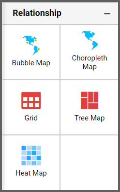
These widgets allow you to visualize large amounts of data as clustered rectangles with a color scale.
Assigning the Data to Heat Map Widget
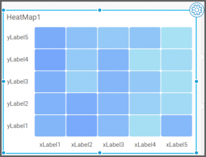
First, I need to drag the heat map widget from the “Relationship” section of the widget menu onto my dashboard. Then, I am going to resize it by dragging its edges so that it will be easy to read. This is what my heat map widget looks like before I have assigned data to it.Next, I will click the “Settings” button in the upper right corner of the widget. I will then click the “Assign Data” tab.
I would like my heat map to display the average temperature for five states in the southeastern US: Mississippi, Alabama, Florida, Georgia, and South Carolina.
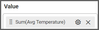
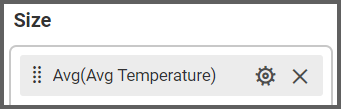
Thus, I will drag the “Avg Temperature” field to the “Value” box.
I am going to leave the “Size” box empty for now, but we will return to it later.
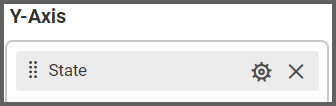
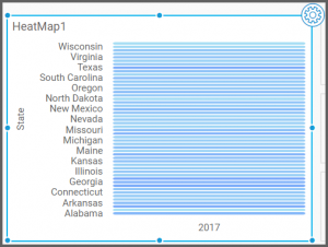
Finally, I will drag the “Date” field to the “X-Axis” box and the “State” field to the “Y-Axis” box.

My heat map has now been created, but it is clear that I need to filter my data to make the widget display the information I would like to see.
Customizing the Heat Map Widget
In order to modify the data that my widget displays, I need to adjust the settings of the fields that I dragged to the “X-Axis” and “Y-Axis” boxes.The “Values” box already contains the information I need (the states’ average temperatures), so I do not need to alter it.

However, I do need to modify the settings of the “X-Axis” and “Y-Axis” boxes because they affect the dates and states that the widget displays, and this is the information I would like to change.
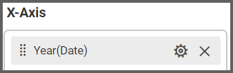
I will begin by looking at the “Date” field in the “X-Axis” box. After I dragged this field to the “X-Axis” box, its name changed to “Year(Date)” as the widget will display the data in this format by default.
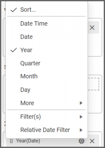
However, I want my widget to show all of the months of the year, so I am going to click the “Options” button and select the “Month” option.
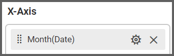
Now, the field’s name has changed to “Month(Date).”
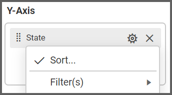
Next, I will adjust the “State” field in the “Y-Axis” box by clicking the “Options” button and then clicking “Filter(s).”
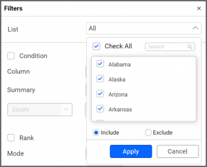
At the top of the box that appears, I see a drop-down list box called “List.” Currently, every state in the US is selected; however, I can uncheck the “Check All” button and then manually select the states for which I would like to see data.
I am going to check the boxes beside Alabama, Florida, Georgia, Mississippi, and South Carolina, ensure that the “Include” button is selected, and click “Apply.”
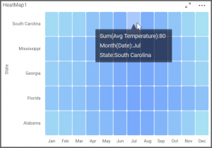
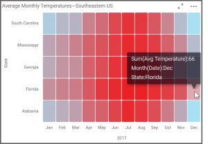
After I click “OK” to exit the “Filters” box, my widget looks like this, and if I hover over a rectangle, I can see the average monthly temperature for that state. I am definitely on the right track, but there are a few additional modifications I would like to make.
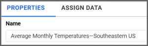
To do this, I will click over to the “Properties” tab. First, I am going to rename my widget. I will call it “Average Monthly Temperatures—Southeastern US.”
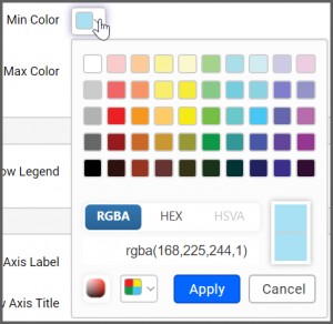
Next, I am going to scroll down to the “Color Settings” section. This section contains two options for my widget’s color scale. The “Min Color” box determines which color is associated with lower values, and the “Max Color” box determines which color is associated with higher values.
Because I am working with temperatures, and because I would like to see a stark contrast between the lowest and highest values on my heat map, I am going to change these colors so that blue is my Min Color and red is my Max Color.
To do this, I need to click the down arrow in the Min Color box and then select the shade of blue I would like to use.
It is worth noting that you can click the “Switcher” button in the lower left corner of the box to create your own custom colors, but I am going to choose a shade of blue from the default options that appear and then click “Apply.”
Next, I will click the down arrow in the Max Color box, select a shade of red, and then click “Apply.”
I would also like to change the name of my heat map’s X-Axis. If I scroll down past the “Color Settings” section, I see a section titled “X-Axis Settings.” Currently, my axis title is “Month(Date),” which is the name of the field that I dragged to the “X-Axis” box in the “Assign Data” tab.
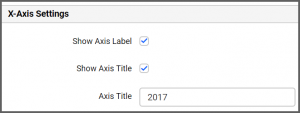
I am going to revise the text in this box so that it says “2017,” which is the year for which I am displaying data. I can immediately see this change reflected in my widget.
Now that my widget looks the way I want it to look, I am going to take a moment to explore its functionality.
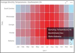
As you can see, the heat map’s rectangles are shaded in different hues of red and blue. The hottest months are bright red, and the coldest months are bright blue. Months with temperatures in between the highest and lowest temperatures are a mix of the colors, with warmer months having more red and cooler months having more blue.
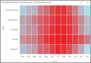
I can hover over any individual rectangle to see a state’s average monthly temperature. For example, I can see that Alabama’s average temperature in December was 46°F and that Florida’s average temperature for the same month was 66°F.
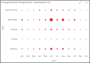
Finally, I would like to explore the functionality of the “Size” box that appears under the “Assign Data” tab. I left this box empty when I created my widget because I wanted my widget to display clustered rectangles. However, it is worth noting that adding a field to the “Size” box will allow you to change the appearance and functionality of your heat map.
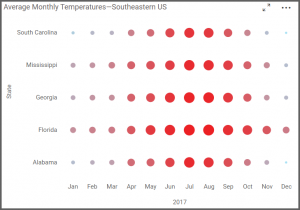
If you drag a field to the “Size” box, the heat map’s rectangles will disappear, and the map will instead display dots of different sizes; these dots represent your data, and the field that you drag to the “Size” box determines the criteria for the dot sizes.
For example, if I drag the “Avg Temperature” field to the “Size” box, larger dots will represent higher average temperatures, and smaller dots will represent lower average temperatures.
The dots are still color-coded; the hottest months are still bright red, the coldest months are still bright blue, and months with temperatures in between the highest and lowest temperatures are a mix of the colors, with warmer months having more red and cooler months having more blue. Now, though, my widget does not merely display information through the dots’ colors; it also conveys information through the dots’ sizes.
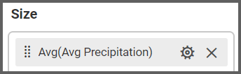
Here is a final example. If I drag the “Avg Precipitation” field to the “Size” box, then larger dots will represent higher amounts of precipitation, and smaller dots will represent lower amounts of precipitation. The colors red and blue still indicate which months had the highest and lowest temperatures. Now, however, I am also able to quickly see which states and months had the highest and lowest precipitation numbers by looking at the widget’s dot sizes.
As you can see, this functionality can be very useful as it provides a quick visual reference for not one but two pieces of data simultaneously (in this case, the states’ average temperatures and average precipitation, with the average temperature represented by color and the average precipitation represented by dot size).