How to Create a Bubble Map Widget
Getting Started with Bubble Map Widget
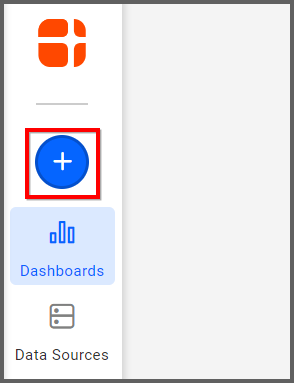
If you are a Bold BI Cloud user, log in to your cloud site account. If you are an Embedded BI user, open the Bold BI application installed on your server.
Click the “New Dashboard” button and select the “Blank Dashboard” option. A pop-up box will prompt you to configure a data source.
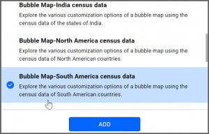
Bold BI has a great variety of sample data sources to choose from, and for this dashboard, I am selecting our “Bubble Map—South America Census Data” data source.
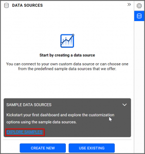
Simply select the data source you would like to use and click “Add.”
Selecting the Bubble Map Widget
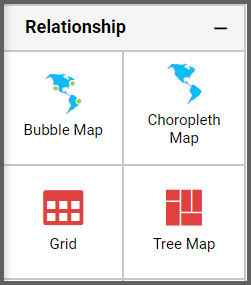
Once you have chosen a data source, you can start selecting widgets. For this post, I am going to create a bubble map widget.
These widgets allow you to display quantitative values that are encoded through bubble size. They use different bubble sizes to represent differences in the data being displayed.
Assigning the Data to Bubble Map Widget
First, I need to drag the bubble map widget from the “Relationship” section of the widget menu onto my dashboard. Then, I am going to resize it by dragging its edges so that it will be easy to read. This is what my bubble map widget looks like before I have assigned data to it.
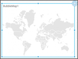
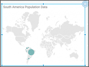
I would like my widget to display population data for the continent of South America, and now that I have moved the widget to my dashboard, I can assign data to it. First, I will click the “Settings” icon in the upper right corner of the widget.
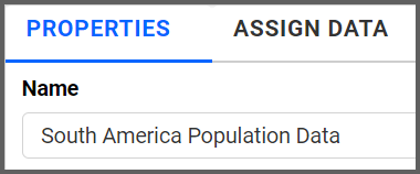
Next, I will click the “Properties” tab and change the widget’s name from “BubbleMap1” to “South America Population Data.”
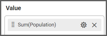
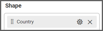
Finally, I will click the “Assign Data” tab. I know that I want my widget to display the population of each country in South America, so I will drag the “Population” field to the “Values” box and the “Country” field to the “Shapes” box.
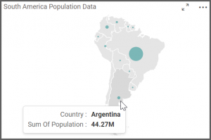
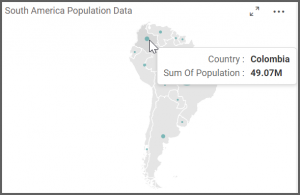
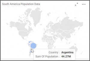
My widget now shows a bubble map of South America, and if I hover over a particular country, I can view its population data.
Customizing the Bubble Map Widget
Now that my widget displays the information I want it to display, I am going to click the “Properties” tab to customize my map.
If I scroll down to the “Basic Settings” section, I see that I have the option of changing my bubble color. I can click the arrow in the “Bubble Color” box to change the color scheme of my map. I can choose a preselected color, or I can click the “Switcher” box in the lower left corner to create a custom color.
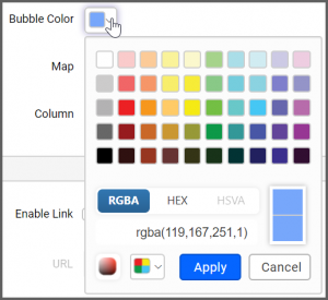
In this case, I have changed my bubble color to a custom shade of teal.
The “Basic Settings” section also offers me the option of changing my map’s appearance. A map of the world (“WorldMap Countries”) is selected by default; however, if I click the “Map” drop-down list box, I can choose from a variety of different national and continental maps.
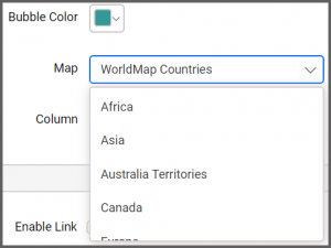
Because I am only looking at data for South America, I am going to select the South America map option. My widget’s map immediately changes from a map of the world to a map of South America.
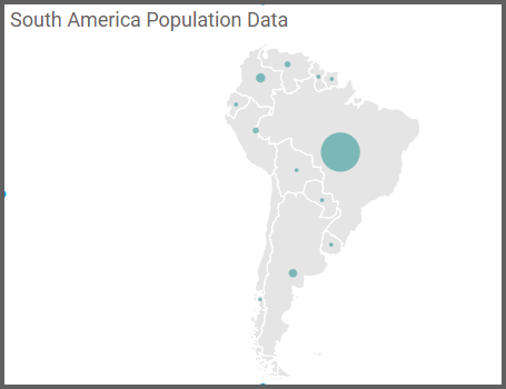
Now that my widget looks the way I want it to look, I can test its functionality by hovering over a few countries to see their population data.