How to Create a Stacked Bar or Column Widget
Getting Started with Stacked Bar or Column Widget
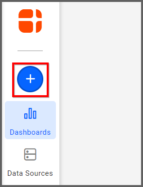
If you are a Bold BI Cloud user, log in to your cloud site account. If you are an Embedded BI user, open the Bold BI application installed on your server.Click the “New Dashboard” button and select the “Blank Dashboard” option. A pop-up box will prompt you to configure a data source.
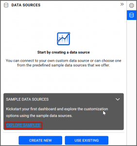
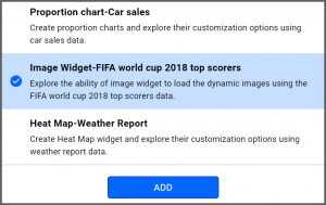
Bold BI has a great variety of sample data sources to choose from, and for this dashboard, I am selecting our 2018 World Cup data source.
Simply select the data source you would like to use and click “OK.”
Selecting the Stacked Bar Widget
Once you have chosen a data source, you can start selecting widgets. For this post, I am going to create a stacked bar widget. These kinds of widgets are particularly useful because they allow you to compare multiple pieces of information in the same widget.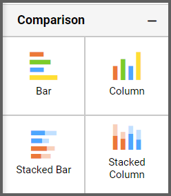
Assigning the Data to Stacked Bar Widget
In this widget, I would like to be able to see the total number of goals scored by teams compared to the total number of shots they took. In order to make my widget easy to read, I am going to display the information of only the top six goal-scoring teams.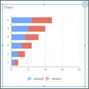
First, I need to drag the stacked bar widget from the “Comparison” section of the widget menu onto my dashboard. I am going to resize it by dragging its edges so that it will be easy to read. This is what my stacked bar widget looks like before I have assigned data to it.
Now that I have moved the widget to my dashboard, I can assign data to it and customize its appearance. First, I will click the “Properties” icon in the upper right corner of the widget.
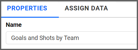
Next, I will click the “Properties” tab and rename the widget “Goals and Shots by Team.”
Finally, I will click the “Assign Data” tab. I know that I want my data to be organized according to the different teams that played in the World Cup, so I am going to drag the “TeamName” field over to the “Columns” box.
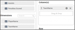
I also know that there are two pieces of data I want to compare: the number of goals each team scored and the number of shots they took. To achieve this, I need to drag those two fields to the “Values” box.
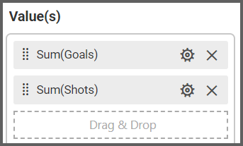
My widget has now been created, but I am going to customize it further.
Customizing the Stacked Bar Widget
First, I want to narrow the scope of my widget so that it only displays the top six goal-scoring teams. To achieve this, I simply need to filter the data.In the “Assign Data” tab, I will click the “Options” button that appears beside the relevant field. In this case, I want to filter the data that relates to teams, so I will select the “Options” button for the “TeamName” field. After clicking the “Options” button, I will click “Filter(s).” This will allow me to filter the data according to my desired criteria.
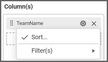
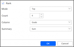
In order to display the top six goal-scoring teams, I simply need to click the “Rank” checkbox, select “Top” from the drop-down list box for the “Mode” option, and change the “Count” option to 6. Finally, I need to change the “Column” drop-down list box to “Goals.”
This ensures that my data will be filtered such that the widget will only display the top six goal-scoring teams.
After I have filtered the data using the “TeamName” field, my widget looks like this.
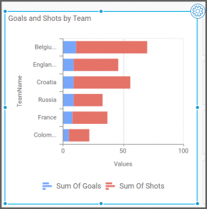
Remember that the “Goals” measure is currently placed above the “Shots” measure in the “Values” box. However, the widget’s appearance will change depending on where you place the fields in the “Values” box.
For example, if I move the fields in the “Values” box so that the “Shots” measure appears above the “Goals” measure, my widget looks like this.
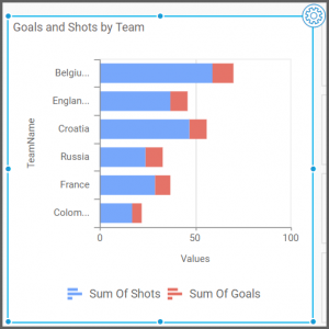
As you can see, changing the order of the fields in the “Values” box changes the way the data is displayed on the widget. In the first screenshot, goals are represented by the color blue, and they appear first in the bar. In the second screenshot, goals are represented by the color red, and they appear second in the bar.
I would like goals to display first in my widget’s bars, so I am going to move the “Goals” value so that it sits above the “Shots” value as it originally did. However, this is just another example of how customizable Bold BI’s widgets are.

Finally, I am going to add one more customization to my stacked bar widget: a multi-level drill down option. As the name implies, this option will allow me to drill down my data even further by displaying another level of information.
In this case, I would like to modify my widget so that if I click on a team’s bar (which shows the team’s total number of goals and shots), I can see a breakdown of which players on the team took shots and scored goals.
Making this customization will require me to change the data that is associated with my bars, so I need to navigate to the “Columns” box under the “Assign Data” tab. Currently, the only field in the “Columns” box is the “TeamName” field. If I would like my widget to display individual players’ statistics, I need to add the “PlayerName” field.
When I drag the “PlayerName” field to the “Columns” box, a pop-up appears asking if I want to enable multi-level drill down.
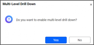
After I click “Yes,” my “Columns” box looks like this.
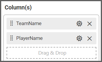
My widget has not changed its appearance; it still looks the same as it did before. However, because I have enabled multi-level drill down and have added the “PlayerName” field beneath the “TeamName” field, the functionality of my widget has changed. I can test the widget by clicking the “Preview” button in the upper right corner of my dashboard and navigating to the stacked bar widget.
Previously, the bars on my widget were not clickable. If I hovered over a bar, I could see the team’s number of goals or shots, but nothing happened if I clicked the bar itself.
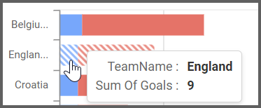
Now that I have enabled multi-level drill down, I can click each bar of the widget to display additional information. In this case, I added the “PlayerName” field, so I will be able to see additional information about individual players.
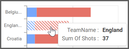
As you can see, when I hover over a bar on the widget, I am still able to see the team’s number of goals or shots. Now, though, diagonal lines appear, indicating that I can click the bar to view additional information.

For example, if I click Belgium’s bar, I am able to see statistics for all six of the Belgian players who have taken shots and scored goals.
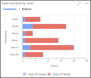
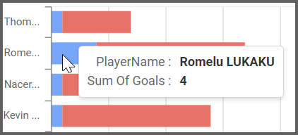
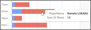
My drilled-down widget display has the same functionality as the main widget. If I hover over a bar, I am able to see the player’s full name, along with the total number of shots they took or goals they scored.
The drill up feature allows you to return to the previous view by clicking on the “TeamName” in the above widget.
As you can see, the multi-level drill down feature is extremely useful if you need to see multiple pieces of big-picture data (such as the sales numbers from several divisions) but also need access to more detailed information (such as the numbers for individual sales reps or a breakdown of the different products that each division has sold).
Multi-level drill down is available with 15 different Bold BI widgets. All of the widgets in the Comparison, Proportion, and Distribution sections of the widget menu offer this feature, allowing you endless customization options.
