How to Create a Column or Bar Chart Widget
Getting Started with Column and Bar Charts
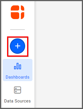
If you are a Bold BI Cloud user, log in to your cloud site account. If you are an Embedded BI user, open the Bold BI application installed on your server.Click the “New Dashboard” button and select the “Blank Dashboard” option. A pop-up box will prompt you to configure a data source.
Bold BI has a great variety of sample data sources to choose from, and for this widget, I am selecting our 2018 World Cup data source.
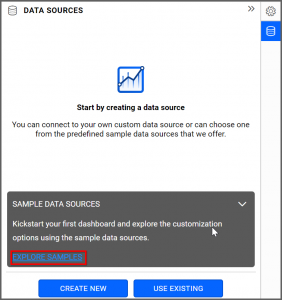
Simply select the data source you would like to use and click “OK.”

Selecting the Column Chart Widget
Once you have chosen a data source, you can start selecting widgets. I am going to create one of the most popular widgets, a column chart.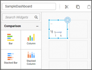
After I drag and drop the column chart from the “Comparison” section of the widget menu to my dashboard, it looks like this.
Assigning the Data to Column Chart Widget
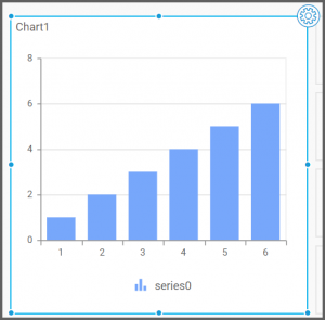
Now that I have moved the widget to my dashboard, I can assign data to it and customize its appearance. Resizing the widget is a good first step. Simply grab the edge of the box and drag it until it is the size you would like.When you are ready to assign data to the widget, select it; then, click the “Properties” icon in the upper right corner of the widget.
Two tabs will appear: “Properties” and “Assign Data.” I want my widget to display the top goal scorers from the World Cup, so under the “Properties” tab. Hence, I am going to change the name of my widget from the default “Chart1” to “Top Goal Scorers.”
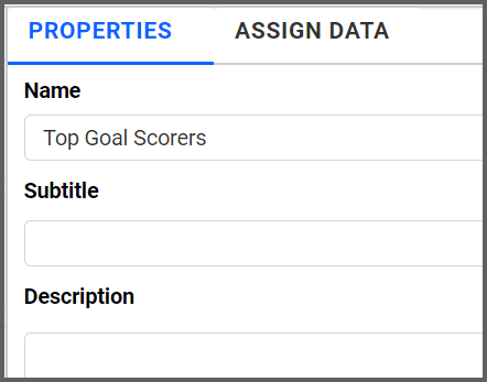
For my purposes, a single title is sufficient, but you can add a subtitle and even a description of the widget if you like.
Then, I will click the “Assign Data” tab. You can drag different pieces of data to different parts of the widget (in this case, its columns) to display the statistics that interest you. I would like my column chart to display the top goal scorers, so I need to figure out how to make my widget show that information.
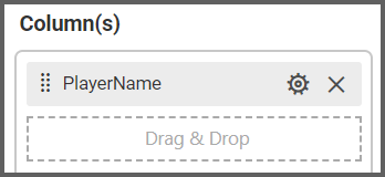
First, I will drag the “PlayerName” field to the “Columns” box. This ensures that each column will represent a player name.
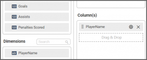
Next, I will drag the “Goals” field to the “Values” box. This ensures that the value being displayed is the number of goals scored by each player.
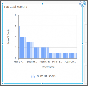
My widget was created successfully, but as you can see, it is a bit unwieldy and difficult to read because it contains so much information. It would be helpful if I narrowed down the data that I would like to display.
Narrowing Down the Data for Column Chart Widget
With Bold BI’s Dashboard, it is easy to filter data by virtually any criteria you like. In the “Assign Data” tab, select the “Options” button that appears beside the relevant field. In this case, I want my widget to display fewer player names, so that is the field I need to work with.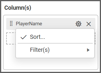
After you click the “Options” button, click “Filter(s).” This will allow you to filter the data according to your desired criteria.
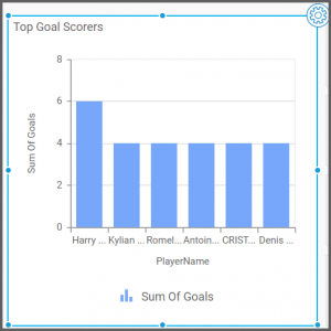
In order to display the top six goal scorers, I simply need to click the “Rank” checkbox, select “Top” from the drop-down list box for the “Mode” option, and change the “Count” option to 6. Finally, I need to change the “Column” drop-down list box to “Goals.”

This ensures that my data will be filtered such that the widget will only display the top six goal scorers.
The Finished Column Chart Widget
As you can see, my widget now displays only the number of goals scored by each of the top six goal scorers.It is also worth noting that hovering over each individual bar will display the player’s full name and the total number of goals they scored. Though this data is easy to read because the numbers are fairly low, this feature is very helpful when you are looking at larger numbers (such as sales figures).
If you would like the bars of your widget to be displayed horizontally rather than vertically, you can build a bar chart widget using exactly the same steps that are outlined above.
The bar chart and column chart widgets both compare values for a set of items; the only difference between them is that the column chart uses vertical bars while the bar chart uses horizontal bars.

